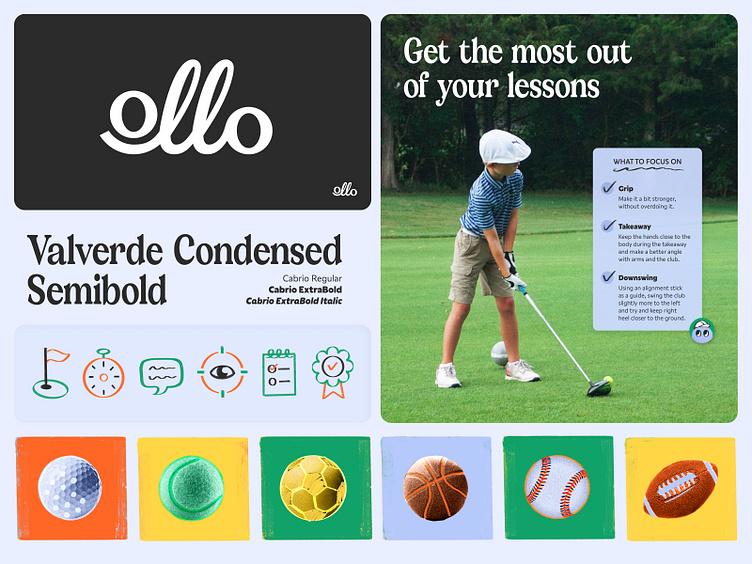
Ollo — Visual Identity Direction
Making Strides in Sports and Character
This visual identity direction celebrates the non-linear journey of learning sports.
The custom logotype is set in all lowercase for a more approachable and youthful feel. The two L's are set in a loop that represent a few key values: (1) progress through repetition and practice, (2) a non-linear progression that celebrates the journey of learning, and (3) dynamic movement that alludes to making strides. The consecutive line between the two O's also symbolizes connection between the kids, coaches, families, and communities.
The challenge was crafting a visual solution that could appeal to both kids (ages 6-16) and adults (35-50). I chose a serif font that speaks to adults to pair with a more playful iconography style that appeals to kids.
Badges & stickers!
More by Jackie Kao View profile
Like


