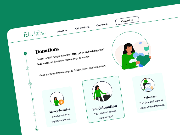
Donation screen
Redesign of a donation website.
The content hierarchy has been meticulously restructured, ensuring a seamless and intuitive presentation. The donation process is divided into 6 distinct steps, displayed on the left side throughout the entire journey for an improved user experience.
Users are empowered with immediate choices, allowing them to opt for a food donation, a monetary contribution, or to volunteer their time. And everything is now integrated into the revamped user interface that adopts colours from their brand identity in a more modern and delicate way.
Visit my website to discover more!
Want to say hi?
Drop me a few lines on LinkedIn
More by Alessia Da Deppo View profile
Like
