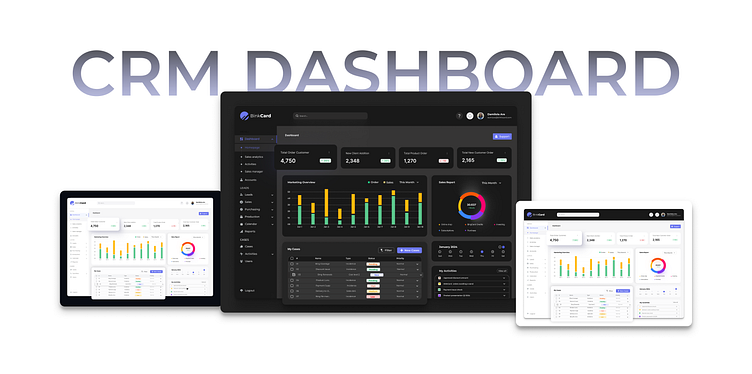
BlinkCard CRM Dashboard
CRM Dashboard Design: Thought Process and Decisions
Understanding the Client's Needs:
I designed this CRM dashboard for a client who needed a clear and concise overview of their sales performance, customer acquisition, and overall business health. They wanted the ability to quickly grasp key metrics and drill down for deeper analysis.
Designing for Usability and Clarity:
I prioritized a visually appealing and user-friendly design. The clean layout and uncluttered interface utilize a card-based structure for easy information organization. Key metrics are prominently displayed at the top, leveraging a combination of charts, graphs, and numerical values for immediate comprehension.
Meeting Specific Requirements:
I incorporated sections dedicated to sales activity, new customer acquisition, and pipeline health, catering to the client's specific needs. The color scheme aligns with their brand identity, and interactive elements like clickable charts allow for further data exploration. By focusing on clarity, conciseness, and user-friendliness, this design empowers the client to effectively monitor their crucial business metrics.
Full images available on request
I'm open for work: contact me via princejohn.onyemaechi@gmail.com let's blend form and function to steal hearts.
