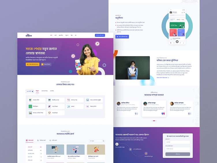
Shikho Homepage Redesign (Edtech)
Revolutionizing Education Through The Internet
During my time as a design lead at Shikho Technologies Ltd., I took on the challenge of redesigning our website to reflect a new brand identity and improve the user experience. Our primary goal was to change the information architecture (IA) to reflect the e new business model and product offerings.
We used our brand's new colors and font in the design, and we expanded our contents to cover all subjects from the SSC and HSC syllabus, rather than just two. So we show the subjects in the 2nd section to give the user a way to choose the desired subject for them. We found out that users don't want courses for all subjects. They look for topics on which they are weak. So we show them the subjects first before showing the courses. Next, we show them the courses. We included a section to display our mobile app. We added a promotional video and a testimonial to help develop trust.
We chose a colorful, vibrant style because we were targeting young school and college students. However, because the guardians also looked over our website to see what classes we offered, we did not make it uncharacteristic.
It was more than just a redesign—it was about redefining accessibility and resonance. Take a peek and let us know your thoughts!

