Fitness Web App
Heyooo! Meet Fitness App design 🤸
😊 The service offers lessons and exercises that enhance users’ flexibility. It provides ready-made daily workout plans and illustrations that show how to do exercises correctly 👍
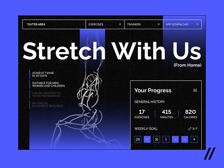
👀 The shot displays a web screen with information about the app and its advantages. Besides, here you can see the cards similar to those available in the mobile app.
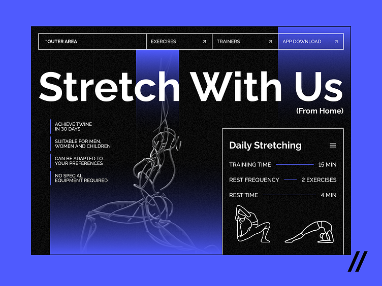
🌊 The blue accents are associated with peace and serenity, so they help create an atmosphere of relaxation and comfort. Also, this color represents purity and professionalism, which inspires trust in users.
The service stands out, because of its big typography and impressive graphic UI elements. These characteristics not only make the app more attractive, but also enhances readability and users’ visual experience 🔥
Press 💜 if you like design and share feedback!
Interface by Anna Nikonorova
Motion by Nikita Rozhkov
