Nescart Branding - Brand Identity Design
Revitalizing the brand identity for an online grocery shopping store
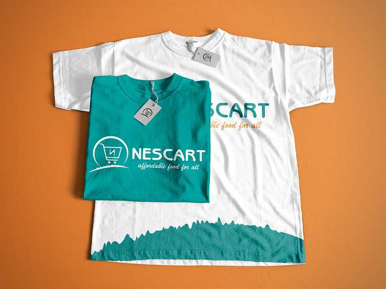
Nescart is an online grocery store. They sell locally sourced foodstuffs at affordable prices ranging from grains, tubers, seafood, soup ingredients, vegetables and fruits, household supplies, and other daily essentials.
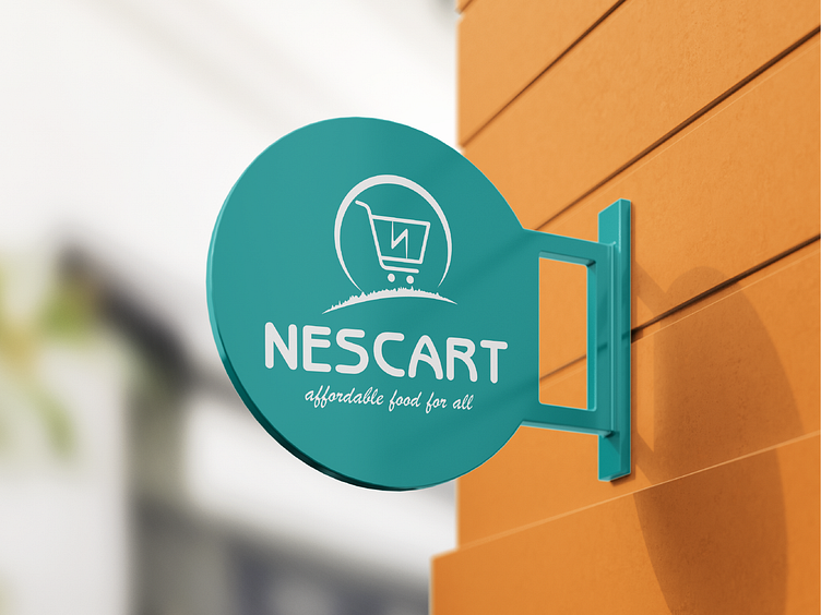
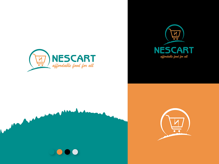
Though the identity is descriptive as one can easily say what the company does, there is intrinsic meaning to the elements used. The shopping cart hint at the services of the brand, and we manage to infuse the initial of the company name 'N' shaped like a lightning icon to depict speed delivery. An abstract representation of the sun and fertile land for agriculture housed the shopping cart.
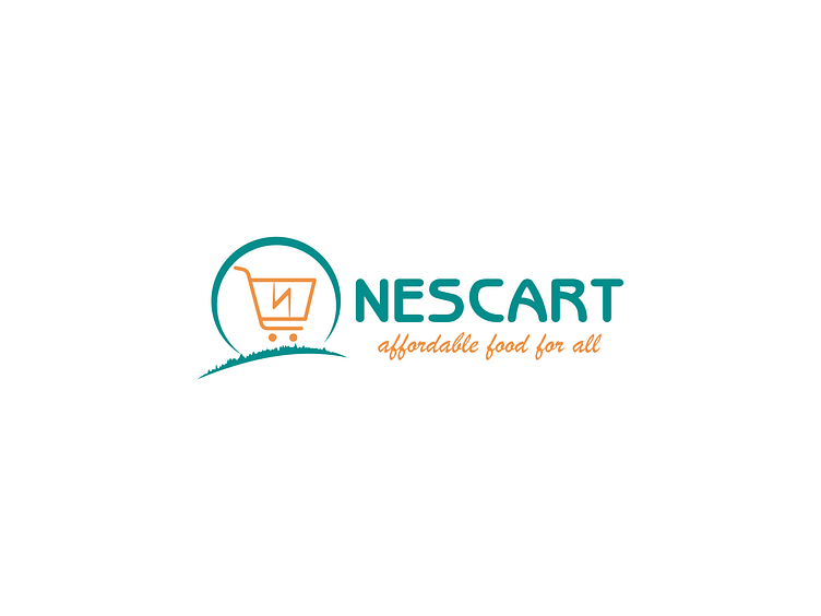
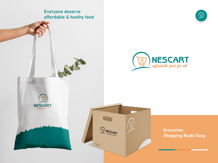
The coloring is apt; nature (green) and affordability (orange), representing some of the values the brand champion alongside fast service delivery. The roundness of the logotype makes it approachable which is just perfect for the brand. The typography was chosen with an eye to readability and optimized for print, web, and mobile interfaces, and has excellent legibility characteristics in its letter-forms.
Full Case Study: https://oniontabs.com/impacts/nescart
Our Agency - Oniontabs
We're a digital agency focused on helping businesses thrive through the power of strategy and design backed by modern technologies.
We design and develop brand identities, websites, apps, and custom digital solutions for tech startups and service-based businesses so they can scale and acquire more customers.
Check us out at www.oniontabs.com