Syrupy Delight: A Journey into Graphic Design
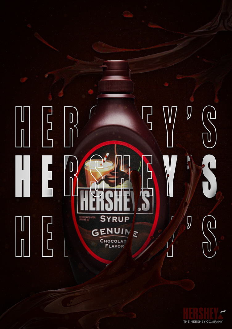
Crafted with passion during my early exploration of Photoshop and graphic design, this poster for Hershey's syrup reflects my dedication and enthusiasm for honing my skills. Through the use of custom shadows, highlights, and carefully selected PNG elements, I endeavored to showcase the irresistible allure of Hershey's syrup. While not perfect, every pixel represents my earnest effort to push the boundaries of my burgeoning expertise and create a visually engaging advertisement that captures the essence of this beloved product.
Chocolaty Symphony: Shades of Indulgence
The choice of three different shades of brown in the poster is a deliberate nod to the rich and indulgent nature of Hershey's syrup. The darkest shade represents the deep, velvety texture of the syrup itself, evoking thoughts of decadent chocolatey goodness. The medium shade suggests warmth and familiarity, reminiscent of the comforting feeling one gets when enjoying a sweet treat. Finally, the lightest shade adds contrast and dimension, mirroring the creamy smoothness of Hershey's syrup as it cascades over ice cream or blends into a delicious beverage. Together, these three hues harmonize to visually convey the irresistible allure and indulgent experience synonymous with Hershey's syrup.


