Didn't Pass _ Spectrum 02
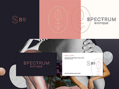
This direction positions Spectrum as a higher end, apothecary vibe boutique. The mark is reminiscent of the male and female gender symbol, a flower, and the vulva. This vulva flower represents growth, life, sexuality, and intimacy. The word mark itself borrows some of the characteristics of the gender symbols. The off pairing of a clean sans serif and old world serif creates a unique tension. The collage of appendages and flesh redefines what our visual interpretation of a body is. Abstract and beautiful, weird and tense...
--
Designer/CD: Eileen Tjan
More by OTHER Studio View profile
Like
