Boxel 3D UI 2.0
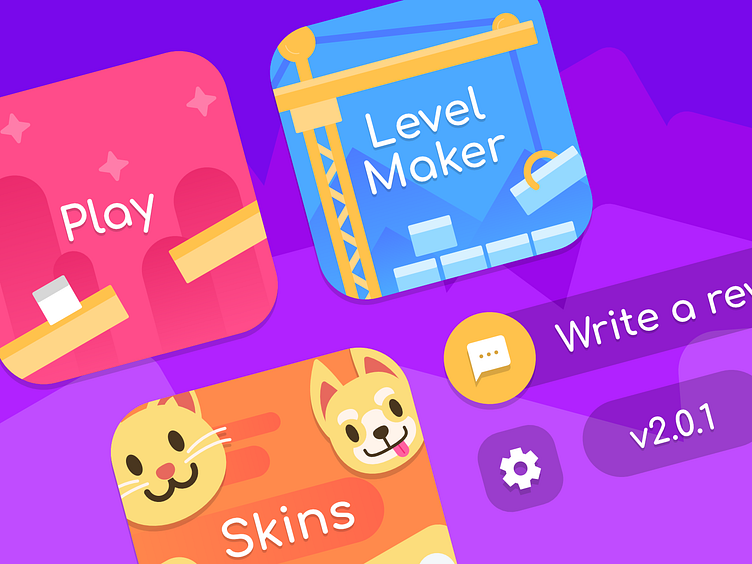
I am currently redesigning the UI for my game Boxel 3D. The new designs introduce a more vibrant color palette with playful graphics.
In contrast, the old UI heavily relied on monochromatic colors with white icons to prioritize usability, but it felt very boring.
UI 2.0
UI 1.0
More by Jacob DeBenedetto View profile
Like


