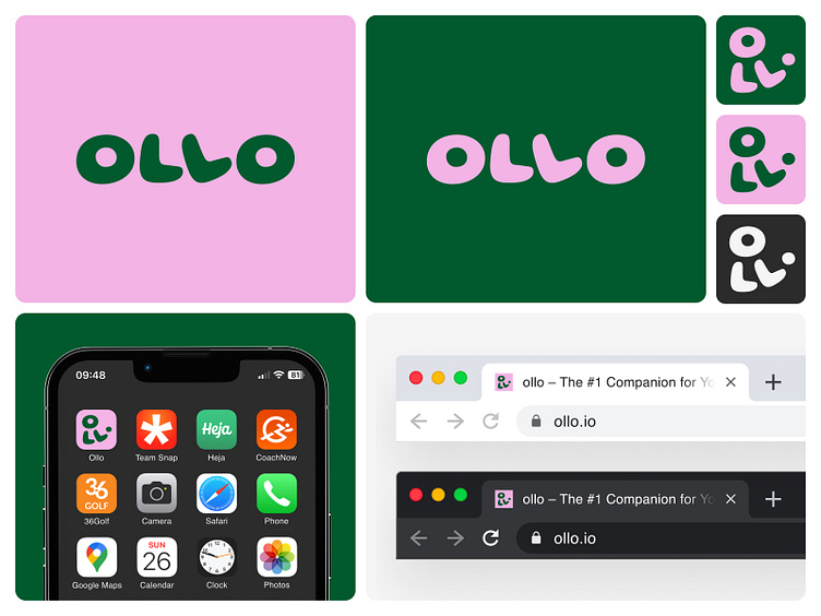
Ollo — Logos and Color Palette
Ollo makes sports more rewarding and meaningful for the whole family.
A key brand differentiator is the emphasis on family nurture and child development. I honed in on this collaboration and unity between the kids, families, coaches, and teams for this brand direction.
I created a custom logotype and mark made of two 'L's that mimic legs kicking (or arms throwing) a ball.
The extended color palette celebrates the communities built around sports. The secondary palette is made up of a rainbow spectrum that symbolizes diversity and acceptance for all.
More by Jackie Kao View profile
Like

