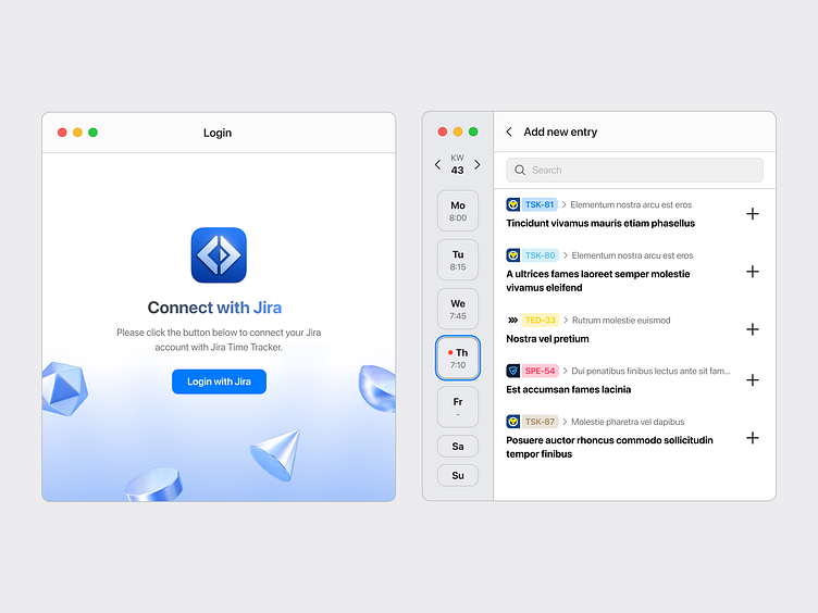
Jira Time Tracker - Design variants
While the dark mode of our Jira Time Tracker app was the "main" design, we also needed a light version which you see above.
In addition to that we added a macOS menubar item for quick access to the app (which you see below). I didn't code with Swift before, so this feature was especially difficult for me.
Our app is mostly written with React Native and one of the main advantages of React Native is the ease of porting the application to different platforms. My colleague works on a Windows computer, so a Windows version was planned from the get-go. I didn't create a separate design for this, but adapted the interface directly in the code. The screens of the Windows app below are therefore actual screenshots and not Figma designs.
We also have a Linux version in our backlog, as many developers work with it.
Feel free to give the macOS version a try already by taking part in our TestFlight Beta.


