Lymphoma and Leukemia Slovakia
Developing a brand that promotes cancer prevention is a challenging task. Our team worked diligently to create a brand identity that was both humble and recognizable, effectively communicating the organization’s mission and values.
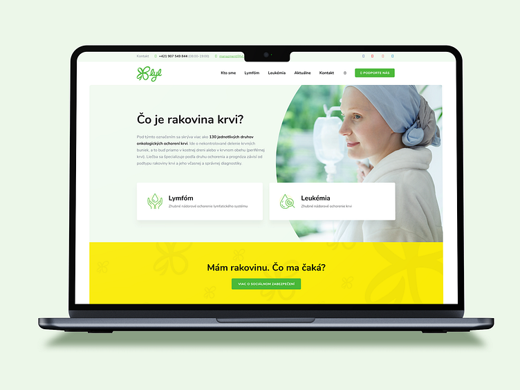
In our latest iteration, we incorporated warm yellow tones and fresh green hues, symbolizing hope and renewal. We also chose simple and crisp icons, which facilitate user navigation and improve the overall user experience of the website.
Our goal was to create a brand identity that not only resonates with the target audience but also supports the organization’s mission of cancer prevention. We remain committed to delivering innovative and effective branding solutions that help our clients achieve their goals.
We also had to develop a user-friendly and secure social network platform, which allows patients and their relatives to connect, share experiences, and find guidance from others who are going through similar challenges.


