Muvez | CRO
I don't know about you but one of my favorite parts about working from home is wearing slippers. When I do leave the house I just love the idea of being able to transform them like what Muvez offers.
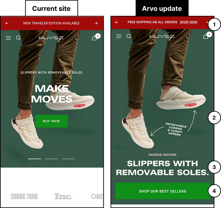
As a value add, I isolated 4.5 quick wins for their website. See the thread for the breakdown!
1) Regardless of what is being featured up here, ensure you are offering an action to take in the announcement bar. You want to continually push users to your conversion pages or the next step in your sales funnel.
2) The image is great, but it doesn’t tell the full story. Either update it to be a GIF that shows the motion of the sole coming off, or add some arrows and specific details!
3) The headline and subheading here need to be switched. “Make Moves” is a marketing tag that offers no clear communication for the user. Make the clearer heading your primary!
4) Make user engagement easy by ensuring key action buttons are full-width on mobile, and sit at the bottom of the fold. If action buttons are short and in the middle, or too far to the left/right, they can be difficult to reach on mobile devices.
4.5) We also suggest pushing users to a specific collection, or if you’re going to take them to a single product page, tell them you are.
