Nada | CRO
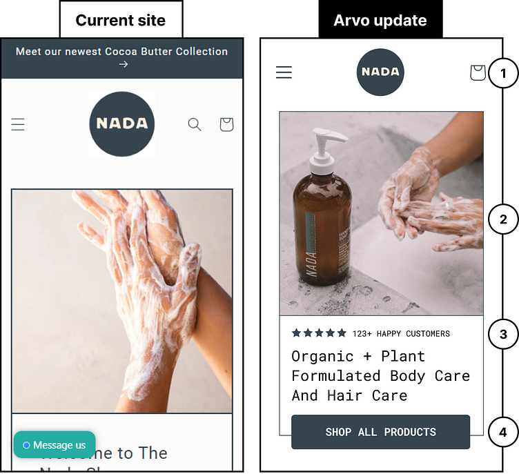
Having a thoughtful product is important today to stand out from the competition and The Nada Shop does just that! As a value add, I isolated 4 quick wins for their website. See the thread for the breakdown!
1) Keep the focus on your primary navigation links only. Move search to your mobile drawer.
2) Use a more enticing lifestyle image where users can see your products better.
3) Positive reviews or total customer numbers are a great way to build trust with users new to your brand — pull them up the page, and call out the total number!
4) Make user engagement easy by ensuring key action buttons are full-width on mobile, and sit at the bottom of the fold. If action buttons are short and in the middle, or too far to the left/right, they can be difficult to reach on mobile
devices.
