Taxi Booking App Design
💌 Have a mobile app idea? We are available for new projects!
hello@ronasit.com | Telegram | WhatsApp | Website
Hello everyone! We'd love to share how our team crafted a design concept for a taxi ordering application streamlined for efficiency and ease.
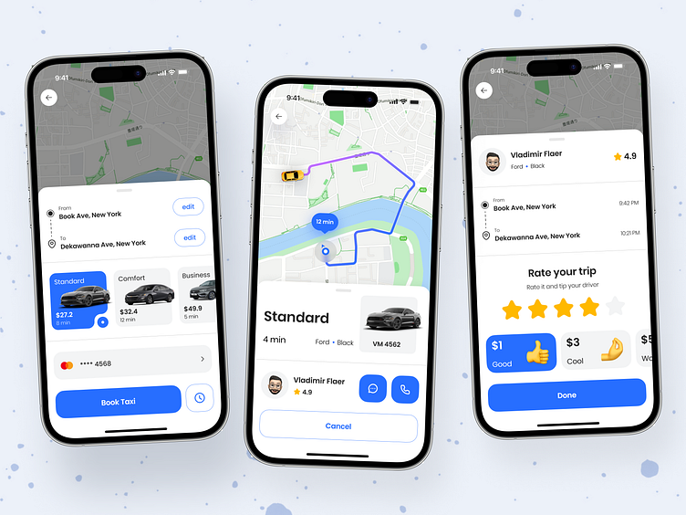
On the opening screen, there are journey's details, including route, fare, and payment method. The second screen displays the estimated time of arrival for the taxi. The last screen provides the option to rate the service and leave a tip.
Our color scheme is light with blue accents, a familiar choice for taxi apps that keep the user focused on quickly arranging their transportation.
The design's main characteristic is its minimal but essential feature set. This concept would serve as an excellent foundation for an MVP of a taxi ordering app, focusing on the core functionalities that users require.


