Unyoked | CRO
Every year, I try to take a few different camping trips to get away from the hustle of everyday life. Unyoked's approach to bringing nature back to human nature just hits! As a value add, I isolated 5 quick wins for their website. See the thread for the breakdown!
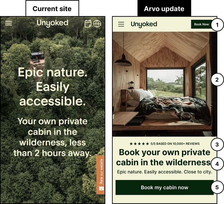
1) You have the room in your mobile nav to add a primary action, so do it! Pull in a ‘Book Now’ CTA to get users started.
2) Separate the image from the copy so that both can be communicated more clearly. Use a hero image where users can see what type of place they are booking.
3) Surface social proof to let new incomers know how many people are happy with your service. (The number is used only as an example.)
4) Don’t forget to tell users what you do and what makes your experience and services great!
5) Make user engagement easy by ensuring key action buttons are full-width on mobile, and sit at the bottom of the fold. If action buttons are short and in the middle, or too far to the left/right, they can be difficult to reach on mobile devices.
