Marketing Expo Leroy Merlin
Every year Leroy Merlin hosts a furniture expo in France where providers have the chance to show off some of their newest products. At the time I was working for a bathroom furniture company that would be presenting at this expo in September 2022. For this we needed some marketing materials which I developed in conjunction with the sales managers and head of design.
Some of the targets that needed to be met were the following:
Create QR code and link to online brochure
Think of creative gift ideas to sales reps which could display our QR code
Design and develop digital brochure
Create and print two vinyls with all the necessary information regarding each furniture piece.
QR CODE
For the user to be able to view the PDF, a link and QR code needed to be created.As a starting point, I created a basic design to see how the code would work and look on various objects for merchandising.One of the initial ideas for this project was to give out Qi wireless chargers as a gift to the Leroy Merlin reps where they could access our digital brochure but also a potential client could scan the code and view our products.
Merchandising ideas
Below are some mock-ups that I prepared as alternatives to the Qi charger as this wasn’t a cost-effective option. The requirement was that these would be objects that would sit on a desk and also be of use to the end user.
QR Final design
Finally, after a few discussions the decision was made to buy some notebooks and pens as gifts for the expo. As these were going to be created for a specific event, we wanted to incorporate some of the branding the organisers used in their marketing materials. Also, we decided to use a green colour to be in line with Leroy Merlin’s brand colours. However as this was going to be on a light brown surface my task was to find the right green that wouldn’t look washed out against this background.
PDF flyer
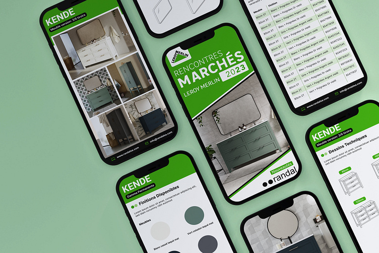
For the first time, the company I worked for decided they wanted a digital brochure rather than the traditional printed version. Users would access this brochure either by link or via the QR code. As this PDF would be seen mostly on mobile devices my task was to create a design that was adapted to mobile screen sizes but also all the necessary information was clearly legible.
Version 1
The first draft of the digital brochure that the QR code would link to. This design used Randal SA’s branding and colours throughout. Some of the images included in this brochure such as finishes on the various models; the wireframes and the examples of finishes were created by me in Photoshop and Illustrator. I used colours to distinguish the two different sections of the PDF: blue for Promos and green for permanent range.
Colours used
Version 2
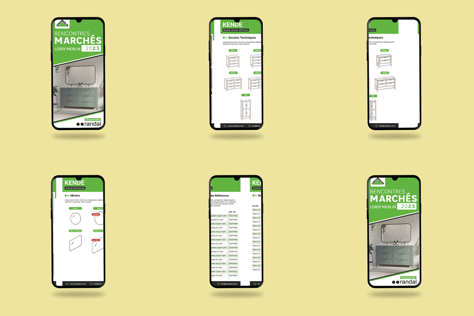
The decision was made to incorporate the branding for the expo in all our marketing materials, so this also affected the design direction of the PDF.
I used the colours from the presentations Leroy Merlin provided to their collaborators. Also included in the opening screen are the logos of the expo and of Leroy Merlin.
Another change was the addition of reference tables for each of the products along with their variations (colours, size, handles etc).
Colours used
Selection of screens from PDF
Vinyl infographics
Taking what was done in the digital brochure I was tasked to create some vinyls with most of the information and options of each range. In total I created two, one for promos and another for permanent range which consisted of the product range “KENDE”.These designs were created in illustrator and the dimensions were 70cm x 100cm for promos and 50cm by 100cm for permanent range.


