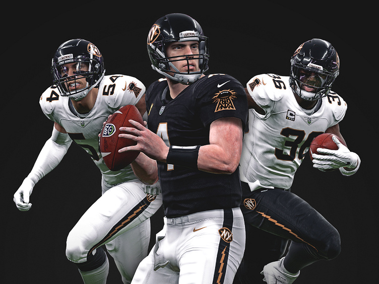
01/32 – New York Lightning Uniforms
Behind the Stitches
The New York Lightning have a more traditional approach to their uniforms.
The black-shelled helmet wears the primary logo on either side, as well as name (Lightning) and location (New York) wordmarks on the front and back bumpers respectively.
The home set includes a black top with white pants, while the away set inverts this with a white top and black pants. There's also the option to mix and match for alternate black-out and white-out (pictured here) sets.
The jersey sleeves feature the Wardenclyffe-inspired secondary mark – which was intentionally drawn fairly squat as opposed to being taller so it doesn't eat up much real estate on the sleeve. The pants incorporate a vertical bolt stripe that is housed by a thicker black stripe on the white set that disappears on the black set. Both sets have the primary logo on the hip.
For the jersey numbers, the Lightning use a modified athletic block to reinforce the traditional feel with a more customized nameplate that incorporates art deco characteristics.
These mockups were made with a modified and retextured Madden 20 on PC. The in-game screenshots were then used to create a composition in Photoshop.
____________________
