Unveiling the Elegance of Neo-Brutalism: Italian Luxury Design

Introduction
In the realm of digital design, Cox Code stands at the forefront of innovation, consistently pushing the boundaries of creativity and functionality. Through our recent concept website design, we embarked on a journey to explore the harmonious fusion of luxury, sophistication, and a touch of brutalist charm.
Design Decisions
Colour Scheme: A Symphony of Dark and Light
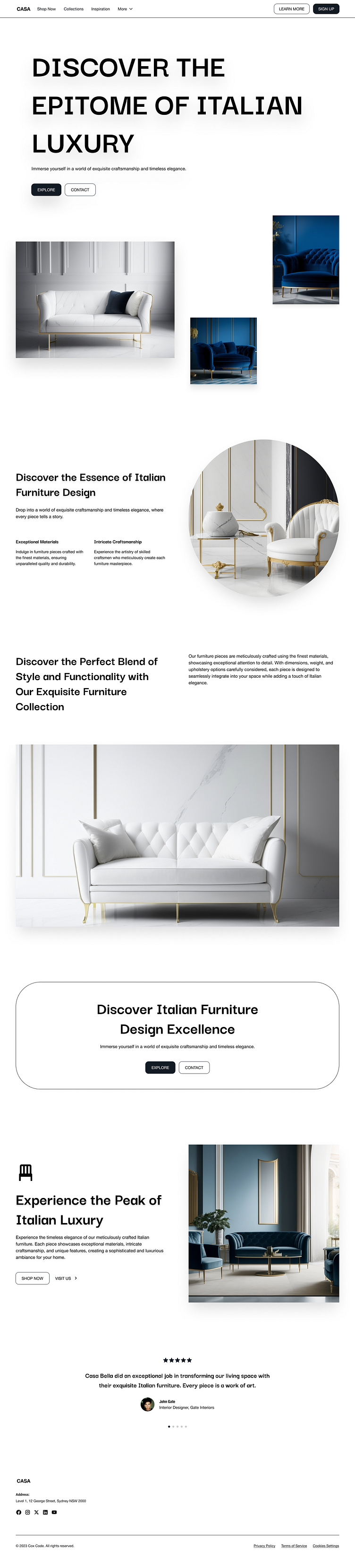
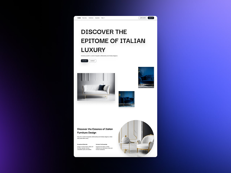
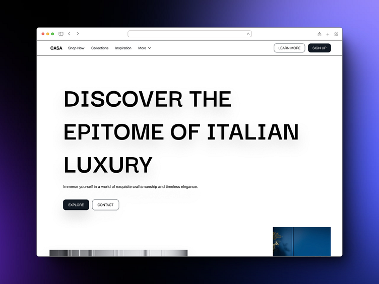
To achieve a sense of opulence and depth, we opted for a dark blue and white colour scheme. The deep blue evokes a sense of sophistication, while the crisp white provides a clean and modern contrast. This combination creates a visually striking backdrop that perfectly complements the essence of the brand.
Minimalist Product Shots: Capturing Elegance
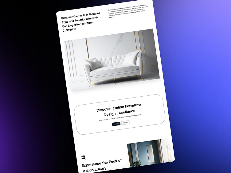
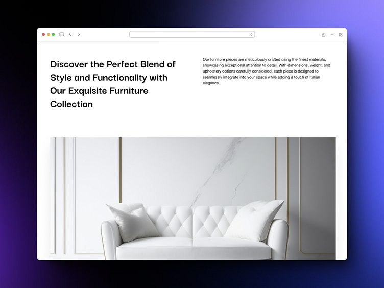
Our approach to product photography was guided by the principles of minimalism. We captured the luxury Italian sofas and furniture in their pure form, against a neutral white background. This allowed the intricate details and luxurious textures to take centre stage, showcasing the craftsmanship and quality of the brand's offerings.
Typography: Brutalism Meets Modernity
The typographical system we developed for the website seamlessly blends the raw, industrial aesthetic of brutalism with the clean lines of modern design. We selected Darker Grotesque, a bold and geometric typeface, for its ability to convey strength and stability. This was complemented by Helvetica Neue, a timeless and elegant sans-serif typeface, which brought a touch of sophistication to the overall design.
Typographical System: An Augmented Fourth
To infuse the website with a distinctly European brutalist aesthetic, we employed an augmented fourth in our typographical system. This musical interval, characterized by its dissonant sound, created a subtle tension that added depth and intrigue to the design. However, we carefully balanced this tension with the use of clean lines and geometric forms, ensuring that the website maintained an overall sense of elegance.
Padding and Space: Accentuating the Aesthetic
We strategically utilized padding and space to accentuate the brutalist aesthetic of the website. Ample white space around elements created a sense of openness and allowed the content to breathe. This negative space also served to highlight the bold typography and minimalist product shots, further enhancing the overall impact of the design.
Conclusion
The result of our design decisions is a concept website that perfectly captures the essence of neo-brutalism: a harmonious blend of luxury, sophistication, and a touch of industrial charm. The dark blue and white colour scheme, minimalist product shots, brutalist typography, and strategic use of padding and space combine to create a visually stunning and engaging online experience that invites users to explore the world of Italian craftsmanship and design.
While this website remains a concept design, it serves as a testament to Cox Code's commitment to innovation and excellence in website design. If you are seeking a design partner who can help you create a truly unique and impactful online presence, we encourage you to reach out to Cox Code today.
Check out our agency site, Cox Code: https://www.coxcode.io
Dialogue with me on X: @benajaero