CRM redesign for Mobile App
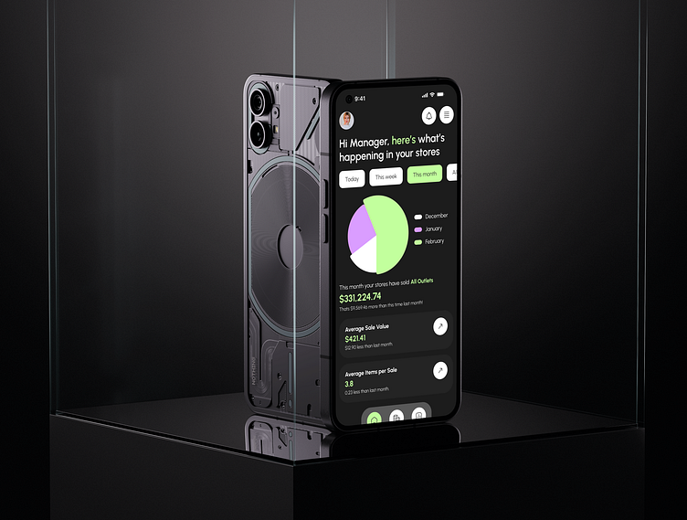
I received a test assignment from an IT company where I had to redesign the CRM system for a mobile application. The main task was to maintain a logical hierarchy and adapt all the data, graphics, and functionality of the current CRM system for mobile devices.
During the design process, I carefully worked on UX, ensuring ease of navigation and access to important functions. To ensure unity and ease of perception, I used a single accent color that helped emphasize key elements on all pages.
What do you think of the implementation?
More by Khrystyna View profile
Like


