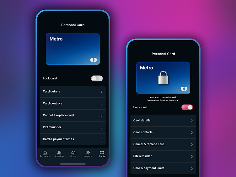
Banking App - Lock Card Screen
At Metro Bank we were looking at ways to effectively communicate that a card is locked and cannot be used to transact in the user's banking app.
The app's look and feel was limited by a very flat design aesthetic. So, I decided to redesign the screen and add some visual design flare to communicate the fact that the card is locked. I also added some copy that clearly communicates the fact that the card cannot be used to transact while locked.
Let me know your thoughts below!
You can view the prototype here: https://t.co/K0KKZY3fQm
More by Rico Smith View profile
Like
