E-mail Marketing
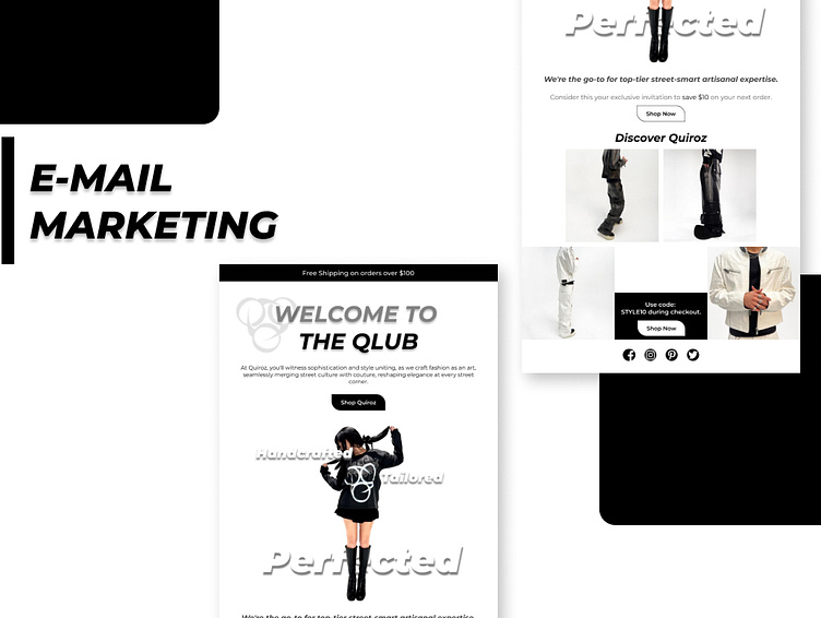
I've meticulously crafted our email marketing graphic, focusing on several key elements to enhance its effectiveness.Headings and Logo Integration: Ensuring all headings are bold and targeted with the company logo enhances visibility and brand recognition, catering to the quick scanning habits of viewers.
Spacing and Division: Maintaining a gap between the title and Sections provides clear division and facilitates easy navigation for the viewer's eyes.
Negative Spacing and Proximity: Attention to negative spacing and proximity enhances readability and visual harmony, contributing to a more engaging user experience.
Typography Choice: Selecting the Montserrat typeface for its versatility and varied variants aids in efficient design and enables diverse stylistic options.
Color Scheme and Style Trends: Opting for a black and white color scheme, along with complementary shapes and tiles, adds sophistication to the design. Incorporating trending text styles further enhances modernity and appeal.
Marketing Fundamentals: By prioritizing eye-catching design elements and ensuring simplicity, I've effectively adhered to fundamental marketing principles, capturing viewer attention and facilitating engagement.
Image Optimization: Careful selection of images within the recommended size and file constraints ensures swift loading times and a seamless user experience. My meticulous attention to image dimensions and file size (276kb) demonstrates a commitment to efficient rendering and optimal performance.