SOLDIERS Logo

A logo made for our church's CARE group: Christ's SOLDIERS (Serving, Obedient Leaders Devoted In Encouragement, Righteousness, and Scriptures).
Made with Photoshop.
Interested? ✉ stefanypaulinemoyco@gmail.com
The Process
First Attempt
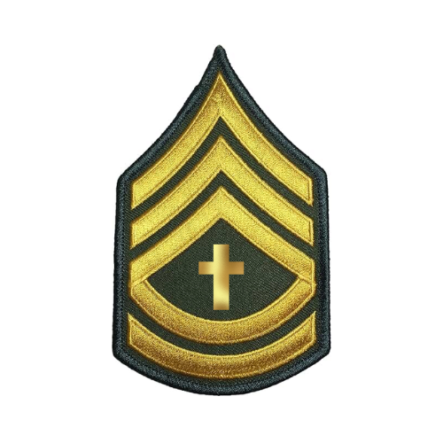
At first, I wanted something simple for our logo—it was going to be used as our group chat's logo, after all—and not wanting to use the armor of God, I went with a modern approach.
So, I googled a soldier's insignia and copy-pasted it into Canva and added a cross at the center.
Although it was clean and effective, our leader wanted something different.
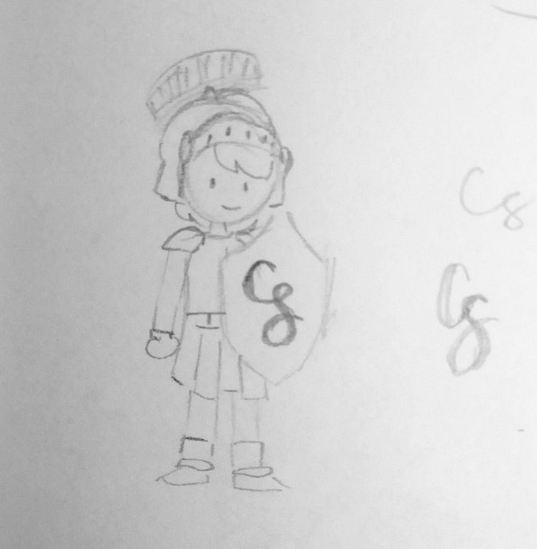
Second Attempt: First Draft
With our group's name being Christ's SOLDIERS (Serving, Obedient Leaders Devoted In Encouragement, Righteousness, and Scriptures), our leader wanted a logo to reflect our group being equipped with the armor of God and featuring our group's acronym.
Hence, a soldier wearing the Helmet of Salvation, Breastplate of Righteousness, Belt of Truth, and Shoes of the Gospel of Peace, while wielding the Shield of Faith and Sword of the Spirit.
Although I touched on our being a girl's group, that wasn't supposed to be the focus. What mattered more was our being a proper soldier for Christ who just happened to be all-female. Plus, I didn't know how to incorporate the sword without the whole thing getting more cluttered.
The first draft of the design felt complicated, stiff, and motionless. In short, it felt bland.
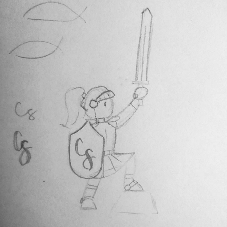
Second Draft
So, I simplified the elements and reposed the character to better incorporate all of the armor. It felt strong and dynamic, without straying too far from the first sketch.
As you can see, I replaced the crest of the helmet and made it into a ponytail to denote the soldier being a woman without adding the typical features used on a female character (e.g. lashes and ribbons).
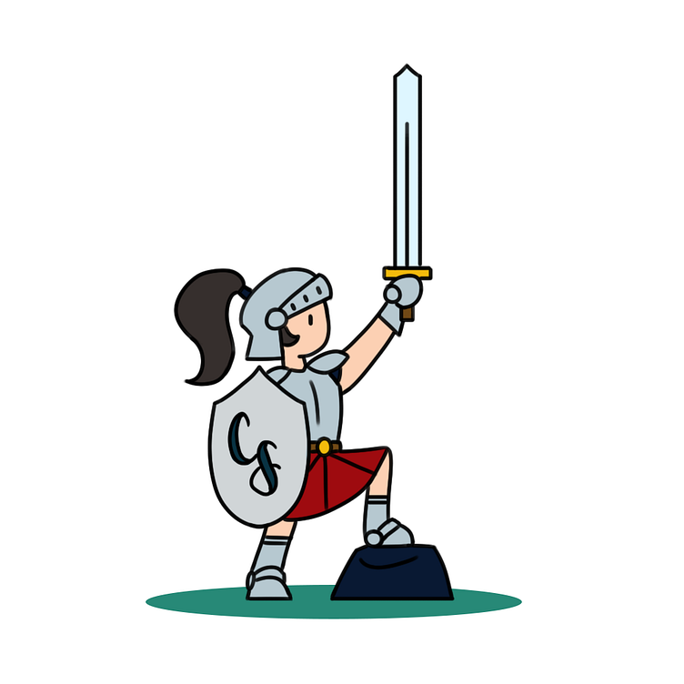
Final
With our leader's approval, I refined the sketch in Photoshop, adding a solid outline and using a cool color palette, using different shades of gray to differentiate the armor and the weapons.
I added a twirl of hair to better indicate that the crest was a ponytail.
And with that, the logo was complete!
