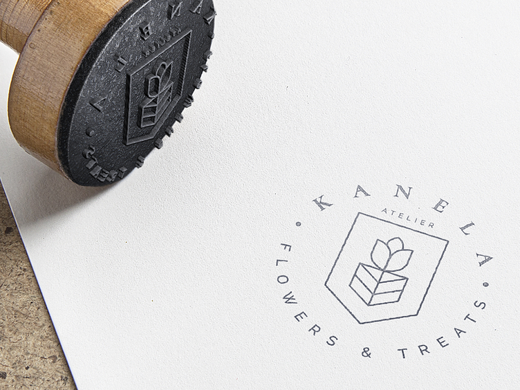
Kanela Branding

KANELA's logo is a seamless fusion of a tulip and a cake, symbolizing the blend of floral beauty and delectable treats.
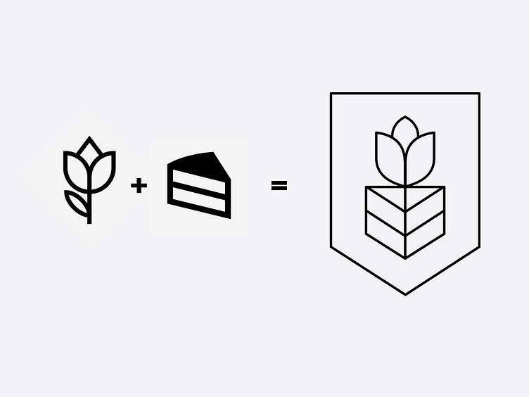
The serif typography exudes sophistication, while the minimalistic and elegant design underscores the simplicity and premium quality of KANELA's offerings. Overall, KANELA's branding encapsulates the essence of their business – a harmonious convergence of nature's grace and culinary artistry.