The Maki House
After closing down during the pandemic, 2 years later The Maki House was ready to open their doors again. As the best sushi in town, they were looking to roll out a new brand identity for their grand opening.
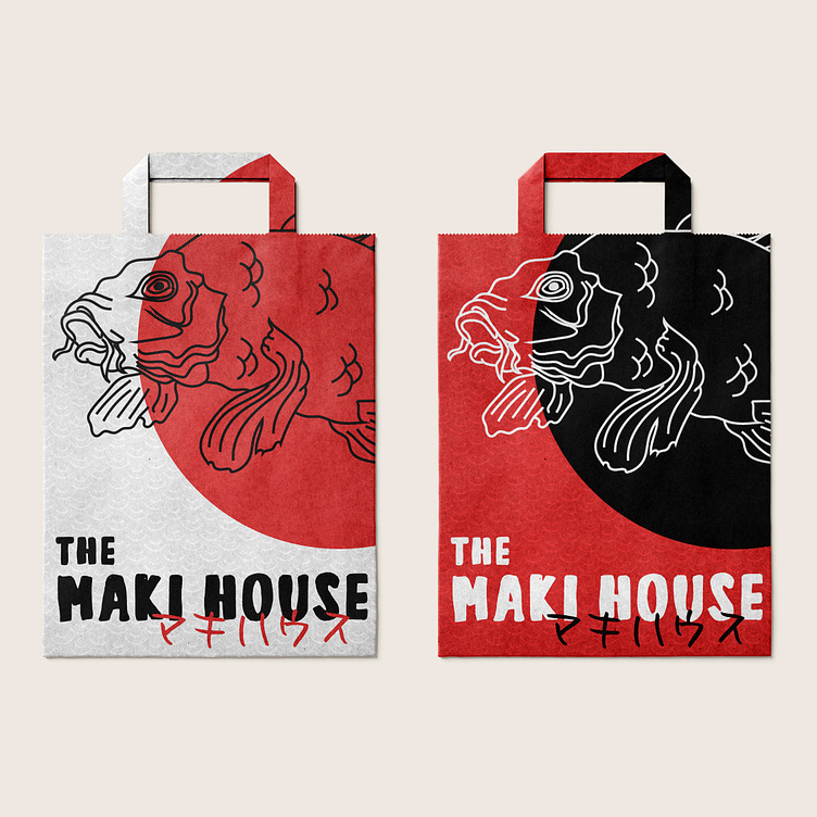
They requested a primary & secondary logo, submark logo, and package design.
To start, I researched some popular Japanese art and design trends, focusing on traditional patterns, colors, and symbols. The color red is very important to and popular in Japanese culture; it is also bold and a favorable color for restaurants & dining, so I chose to focus on this color for the brand. I chose a typeface that would resemble brush strokes often found in Japanese art, and a thin, detailed illustration as part of the logo to balance the bold colors and lines.
Lastly, the solid circle featured in the logo and on the packaging is a link to the Japanese flag and symbol for the sun.
