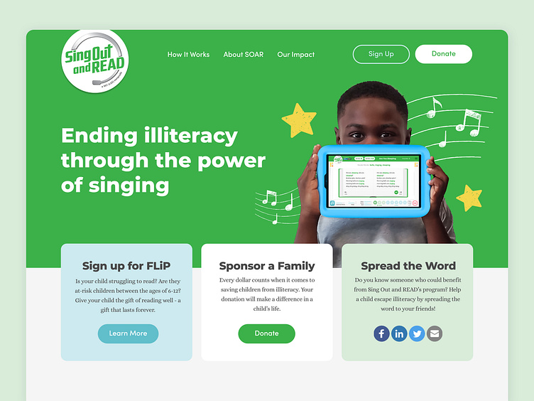
Sing Out and READ Website Design
Sing Out and READ was approached by Kent State University students who analyzed their existing website and found improvements that could be made to their website flow and user journey. Additionally, a custom integration with Qgiv was needed for easier facilitation of donations.
Analyzing the research from KSU, we restructured the website to create a more intuitive user journey which prioritizes either signing up for their Family Literacy Project (FLiP) program or donating to their cause. By giving their brand colors of blue and green purpose, blue for FLiP and green for donation, the website effectively separates these two calls-to-action and gives structure to the brand. Because the website was built in Squarespace, some custom CSS/HTML was implemented to create a more unique, branded experience.
After implementing the new website design, SOAR experienced an influx of new FLiP sign-ups and donations on their website.


