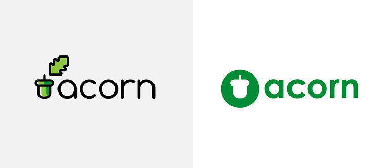
Acorn brand update
The Identity
As the pioneering venture of its kind in the UK, the Acorn project lacked established precedents, prompting a creative approach. In absence of analogous projects, I delved into the realm of existing oil and gas branding, drawing inspiration to craft both flat and line iterations of an acorn motif. The finalized logo, a flat rendition with a palette merging green and teal hues, was chosen by the client for its representation of the project's coastal roots.
Infographics
The focal point of the Acorn project was the primary map, serving as the cornerstone from which numerous other diagrams originated. This foundational graphic presented basic concept, outlining the layout of pipelines and facilities. Expanding upon this, I crafted additional visuals highlighting specific facilities along the pipeline, geographic diagrams of the storage site, and illustrating how shipping and hydrogen integration could seamlessly intertwine within the overarching system.
Education Outreach
Within the project scope was an educational outreach initiative targeting local schools, inviting their participation in diverse educational events. Responsible for crafting a cohesive and visually appealing range of outreach materials for pupils, students, and educators across approximately five planned events, I ensured consistency throughout, weaving them together into a unified brand aimed at educating young minds about carbon reduction technologies.


