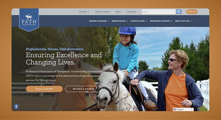
Equine Professionals Membership Website
Massive Content Reorganization
I accepted this challenge of a project within my first month in my role as Web Lead with Evergreen Results. This website was one of the largest websites I've built to date. This website was completed a few years ago, but the sleepless nights are fresh in my memory... We're talking thousands of pages worth of online content that had to be sifted, reorganized, and redesigned.
Not only was this site large, we were basically starting from scratch with designing and building brand new functionality- not including giving the entire online presence a much-needed design facelift. The discovery phase alone took over a month to sift through the content and finally arrive at a coherent sitemap and overall plan for building out the new structure.
Original website
A fresh and cohesive design system
Since the original website was so outdated, and the organization did not have any established brand standards, I was happy to explore some potential design styles for the new website. We started with moodboards – I presented a few options for color pallets paired with typography, icons, image styles/treatment, and even textures. While they were not in the market for a logo update altogether, I did present some new ways to treat the current logo in relation to the website.
Moodboard 1
Mood board 2
Moodboard 3
Finalizing the style guide
Several design rounds later, we landed with a final style guide to move forward with.
The design comes to life
I then worked through wireframing every landing page and content template we could possibly need while the client finished up content writing.
After that, it was off to the races – development was underway. Wordpress is always my CMS of choice- especially with a site this large that requires many bespoke functional elements.
We built out custom post types for various uses. Some of the major lifts were a few interactive maps for member directories (custom integration with salesforce), a fully functioning events calendar, and custom templates for each chapter to have their own landing pages.
On top of custom development, we had to make sure that the back end was easy to use for staff and constituents alike. We used dynamic fields to populate content into page templates so that users updating that content never need to access the design of the page itself. It's as simple as plugging in. the content into it's appropriate field and you instantly have a perfectly designed page.
There were so many interconnected elements of this website that it sometimes felt like we were slowly weaving an intricate web. Take a look around the site yourself, and you'll see what I mean.
Note: We handed off this site to the client upon completion so they currently maintain the site themselves and some design or structural changes may have occurred since the original site launch.


