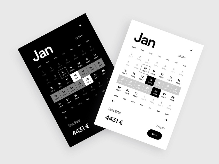
Elegant Calendar UX/UI Design with Daily Pricing
Introducing a sleek, minimalist calendar design that redefines how users interact with availability and pricing. Designed in a monochrome palette, the color choice enhances both its modern look and adaptability.Each date is paired with real-time pricing, offering users a streamlined, mobile-friendly view of their options.
By merging clarity and function, this calendar design promises a more engaging and efficient booking experience. Curious to see how it all comes together? Let’s dive in. ⤵
Classic User Scenario
When planning a trip on an Online Travel Agency (OTA), users traditionally have to navigate through three separate components to complete their booking:
→ Availability calendar: To begin, the user must check which dates are available. They are presented with a grid of dates that shows availability, allowing them to select their desired check-in and check-out dates.
→ Seasonal pricelist: The user has to cross-reference a separate pricelist to understand the cost structure for their stay. This list shows how pricing fluctuates based on seasons, holidays, and special events, which can be confusing and time-consuming to interpret.
→ Price calculator: Once dates and pricing details are clear, the user moves to a price calculator to add up all the costs, including nightly rates, service fees, and taxes. The calculator also determines whether the selected stay meets minimum requirements, adding to the complexity.
Reasons for the Change
While this three-component system has been functional, it presents several challenges for both users and OTAs:
↝ Complexity: Users have to switch between multiple components and manually connect information, leading to a disjointed and less transparent experience.
↝ Error-prone: Manually cross-referencing dates, prices, and seasonal requirements increases the likelihood of mistakes, leading to frustration.
↝Mobile experience: On mobile, navigating between multiple components can become cumbersome, with limited screen real estate.
↝ Increased load times: With multiple components, page load times increase, leading to slower performance, especially on mobile devices.
↝ Inconsistent user flow: Users often lose their sense of flow due to the need to interact with different elements across various sections, especially on mobile devices.
New User Scenario
The new integrated calendar component consolidates all three functionalities into one streamlined user interface. Now the process looks like this:
↦ Availability & pricing in one view: The user is presented with a single calendar that alongside availability also dynamically displays the price per night as they hover over or select dates.
↦ Real-time price calculation: As the user selects their desired check-in and check-out dates, the component automatically calculates the total cost, factoring in seasonal pricing, minimum stay requirements, service fees, and taxes. This eliminates the need for a separate calculator component.
↦ Simplified interaction: The user no longer needs to cross-reference between components, reducing the steps from selection to booking. Everything happens in one clear, cohesive interface, speeding up the process and minimizing potential errors.
↦ Mobile-friendly design: On mobile, the new component is designed with touch-friendly interaction and vertical scrolling, making it intuitive and easy to use within a smaller screen space.
What Was Accomplished
⤅ Improved usability: The new component reduces confusion and increases flow by providing an all-in-one interface, decreasing cognitive load, and improving the user’s ability to complete the booking efficiently.
⤅ Faster decision-making: Users can now make faster, more informed decisions with all relevant information in a single view.
⤅ Seamless mobile and desktop experience: The unified component is optimized for both mobile and desktop platforms. On desktop, users benefit from a clear overview, while on mobile, the layout adjusts for ease of use.
⤅ Less errors: By eliminating the need to switch between separate components or pages, users are less likely to make mistakes, such as selecting unavailable dates or miscalculating costs.
⤅ Enhanced transparency: Pricing is now more transparent, with all costs immediately visible during date selection, leading to increased user trust and fewer booking cancellations.
Shortcomings to Consider
↬ Large price display: Four-digit amounts can disrupt the calendar's readability and must be shortened.
↬ Decimal space: Decimal places take up space, requiring prices to be rounded for clarity.
↬ Multi-month bookings: A single-month view can cause a disjointed experience for bookings that span multiple months.
↬ Backend optimization: Handling extensive data (e.g., day-by-day pricing for several months) requires a robust backend that updates frequently.
↬ Cost-benefit: This solution is best suited for large, dynamic booking systems with numerous listings and users, where frequent updates and dynamic pricing are common.
Conclusion
The shift from a multi-component system to an integrated calendar has significantly enhanced the user experience on both mobile and desktop. Combining availability, pricing, and real-time calculations into one interface speeds up and simplifies the booking process. This change aligns with modern user expectations for seamless, efficient interaction, especially on mobile platforms.


