Infografic – Keystrokes
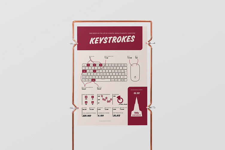
The infographic takes a look at how I use my computer over the course of a month. The focus is particularly on mouse and keyboard input. The data was collected using WhatPulse software. The prominent representation of the mouse and keyboard makes the main topic of the graphic easy to understand. The simple color scheme is not too distracting, but allows important elements to be clearly highlighted.
Dieses Projekt ist im Sommersemester 2023 im Studiengang Digital Media im Fach Interface Design an der Technischen Hochschule Ulm entstanden. Projektinitiator, Projektleiter und fachlicher Betreuer: Prof. Damian Gerbaulet. Autor/-in und inhaltlich Verantwortliche/r: Xaver Pollinger.
Das Projekt ist urheberrechtlich geschützt.
