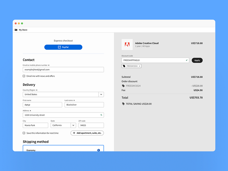
Checkout page UI design by Spectrum DS
sergefomichev.dis@gmail.com
I decided to find out which company's or author's design system is the best, for this I will make some screens using their components in Figma. My goal is to understand how they are organized, to evaluate their usability, completeness and versatility.
Spectrum is a design system developed by Adobe that provides components and tools to enhance the productivity of product teams and create a cohesive experience across Adobe applications. The development of Spectrum is guided by foundational principles.
The Spectrum design system for Figma can be found in the Figma Community. It looks good, has quite a large number of components and their variability. The file I used only had components, and almost no organisms (only cards). Despite this I did not experience any serious inconvenience in assembling the presented screen. The work was quick and enjoyable.
Spectrum offers open-source implementations such as Spectrum CSS, React Spectrum, and Spectrum Web Components, along with detailed usage guidelines. This enables developers to effectively integrate the design system. UI kits are currently only available in Adobe XD.
Follow me on
LinkedIn | Dribbble | Behance | Telegram
or

