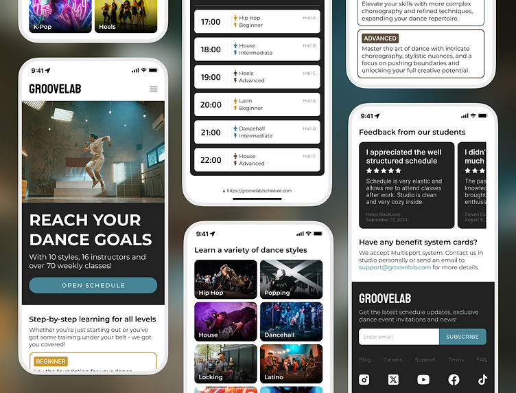
Dance Studio - Landing Page
Overview:
GrooveLab is an imaginary dance studio that provides a dynamic and immersive dance experience for its clients. I’ve created a landing page for them as a demonstration of their services and representation of a visual image.
Objectives:
1) Create a hybrid design, that will work for a webpage and mobile app at the same time. Dance school combines a lot of different styles and promotes classes via marketing elements, such as: photos, videos, banners, high contrast headers. When users enter, their attention should be paid to that elements first, to maximise the results.
2) Include a schedule, that will allow users to see the list of classes and get all the information in the simpliest way.
3) Focus on mobile web-browsers. Nowadays, most people use smartphones for content scrolling, which means the UI should be „smartphone friendly” and comfortable for vertical reading.
Solutions:
I have used earth-toned colors to makr space for bright photos and banners. Minimalistic structure greatly works with a detailed schedule and allows to display a lot of information in an easy way. Dark backgrounds and gold accents add a „premium touch” to demonstrate the high level of provided services.
Result:
Modern web-page for a fast growing dance studio, that displays it's services and builds trust with users, that look for their first dance class experience.


