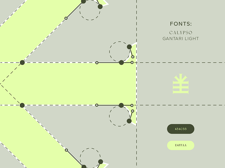
"Pine" brand style
"Pine" is a company that provides recreational services. They own a hotel and spa complex in Katowice, Poland.
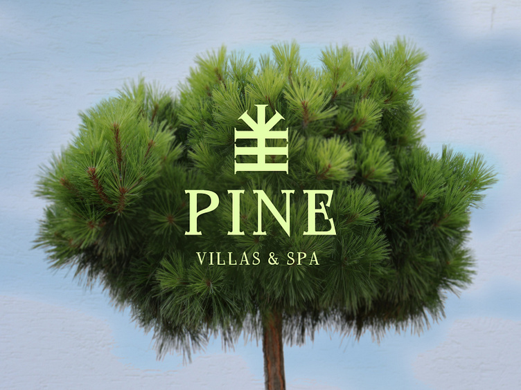
The brand concept is based on the company's main philosophy: calmness and inspiration. Landscapes, ancient coniferous forests and silence contribute to this.
Separate modern houses located on the territory are rented out.
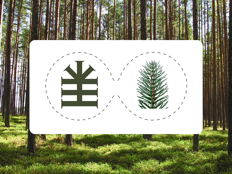
My task was to create a brand style that was appropriate in spirit and status for this complex. The logo was based on a combination of the power of the sunset and a geometric pine branch.
The serif font is the best way to emphasise the inclusiveness and status of the establishment
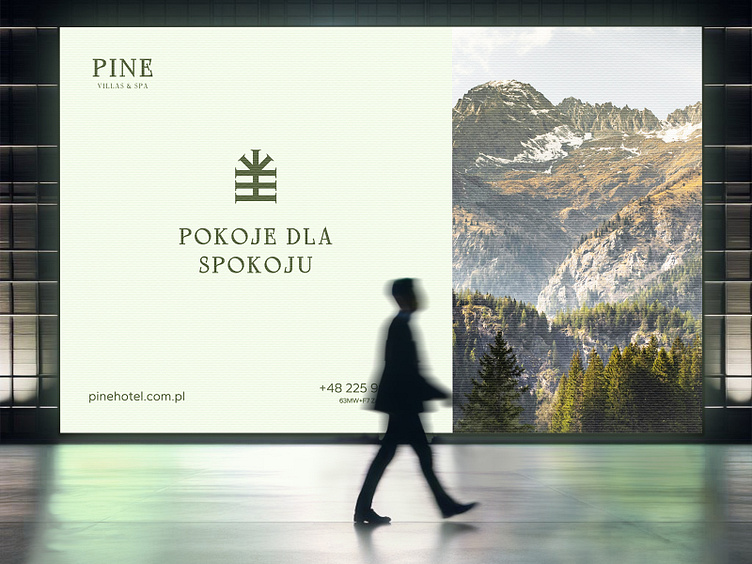
The advert and other animated elements are characterised by clarity and lightness. This is achieved through a clear division of content, separating 40% of the photo from 60% of the main textual content with the background.