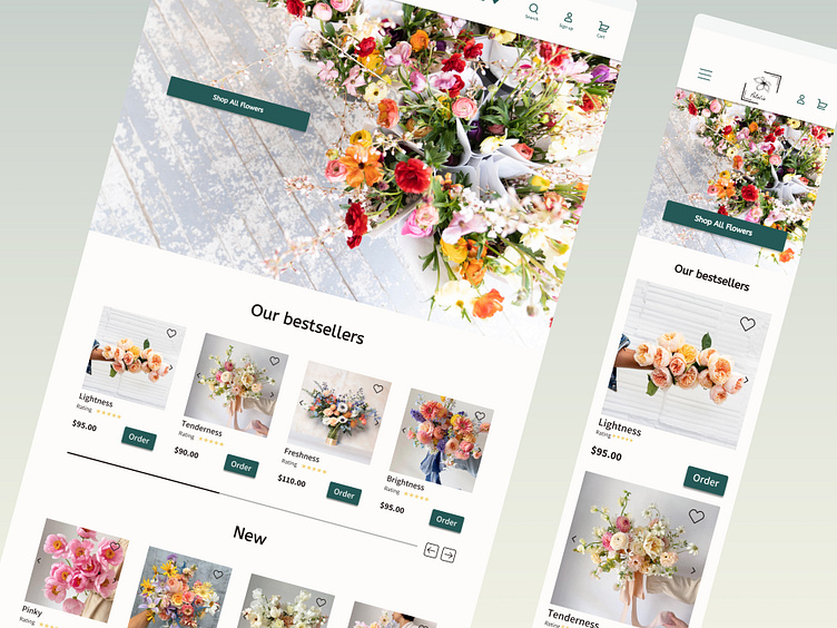
Coursera #2 - Flower Website Case Study
This is my second project completed as a part of the UX Design course in Coursera.
Overview
Petalia is an e-commerce website that offers a variety of flowers, plants, and small gifts for everyday and special occasions. It targets customers aged 21 to 55, including working adults and individuals with limited time to visit physical stores for selecting flowers and plants for themselves and their family members.
My role was conducting interviews, paper and digital wireframing, low and high-fidelity prototyping, conducting usability studies, accounting for accessibility, iterating on designs and responsive design.
The problem
Most available websites are often very crowded, making it challenging to scan them quickly.
My goal
Design a Petalia website that allows easy selection and ordering of fresh flowers and plants by providing clear navigation and offering a fast checkout process.
User research: summary
I conducted interviews and created empathy maps to understand the users I’m designing for and their needs. A primary user group identified through research was working adults who love to have fresh flowers and plants at their house and/or use botanical elements in their work.
Research revealed that user problems include the inability to find the exact flowers or plants they need in the store, difficulty in identifying fresh flowers, and the challenge of obtaining flowers or plants they need on the same day.
Some other challenges users might face are lack of time (working adults sometimes are too busy to drive to different stores in search of flowers and plants that work for them) and websites IA (text-heavy websites are often difficult to read and order from).
Customer persona
Lidia is an interior designer and a flower lover who needs to be able quickly and easily order a wide range of fresh flowers and plants, because she uses high-quality botanical elements in her design projects.
User journey map
Through Lidia's user journey mapping, it became evident how helpful it would be for users to be able to order any flowers and plants through the app online.
Sitemap
Difficulty with website navigation was a primary pain point for users, so I used that knowledge to create a sitemap.
My goal here was to make strategic information architecture decisions that would improve overall website navigation. The structure I chose was designed to make things simple and easy.
Paper wireframes
I sketched out paper wireframes for the potential homepage of the website, with a focus on optimizing the browsing experience for users. "Star" marks show elements that i chose for the final homepage sketch.
Digital wireframe screen size variation
Because Petalia’s customers access the site on a variety of different devices, I started to work on designs for phone screen sizes to make sure the site would be fully responsive.
Usability study: findings
CTA buttons. I added non-active call-to-action buttons in places where users need to fill out forms to prevent confusion in the user flow process.
Order details. There wasn’t an option to see order details after checkout.
Cart. Once at the checkout screen, users didn’t have a way to edit the quantity of items in the cart.
To reduce confusion for users regarding what to press and in what order, I changed the color of the CTA buttons to make it clear they are non-active. Users are now prompted to choose their ‘Zip code’ and ‘Delivery date’ before being able to add an item to the cart.
Based on the insights from the usability study, I made changes to improve the site’s checkout flow. One of the changes I made was adding the option to edit the quantity of items in a user’s cart using a simple “+” or “-” option. This allowed users more freedom to edit their cart without going through a complicated process to add or remove items.
Mockups
High-fidelity prototype
My hi-fi prototype shows a smoother user flow for ordering flowers and includes the design changes made after the usability study.
View the Petalia’s high-fidelity prototype (website).
View the Petalia’s high-fidelity prototype (phone).
Takeaways
Target users shared that the design was intuitive to navigate through, more engaging with the images, and demonstrated a clear visual hierarchy.
I learned that even a small design change can have a huge impact on the user experience. Usability studies helped me adjust the design to make the website smoother to use.


