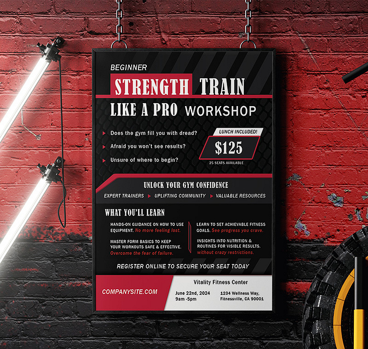
Empower Through Type: Designing 'Strength Train Like a Pro'

Project Overview
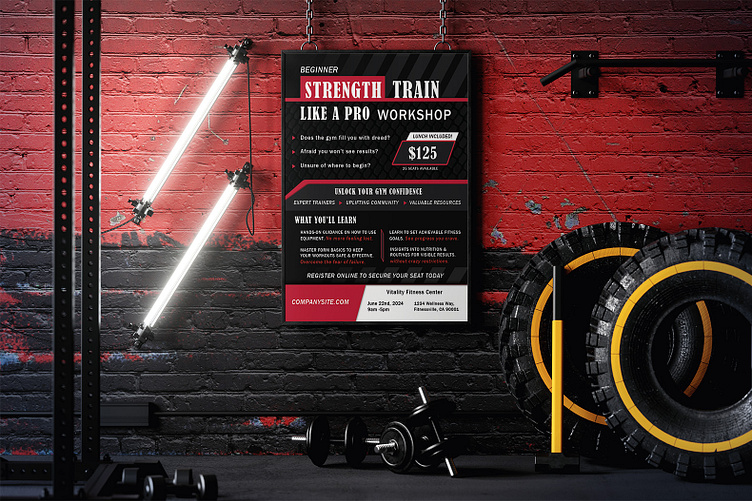
Concept
A typographic exploration designed to captivate and inspire beginners eager to elevate their strength training by learning from professionals. My focus was on developing compelling copy for a mock workshop that speaks directly to a beginner gym-goers' pain points. I am a huge fan of Rennaissance Periodization (RP Strength) and used this as a point of inspiration.
Creative Process
My aim was to create a visual hierarchy that guides the viewer's eye through the poster, using typography as the primary tool for communication.
I created a striped pattern in Adobe Illustrator that is placed at the top and bottom of the poster. This symbolizes the varied journeys toward strength and the layered experiences that shape our fitness paths. Applying a gradient mask overlay to the stripes adds a sense of depth and movement, suggesting the journey to strength is both multifaceted and continuous.
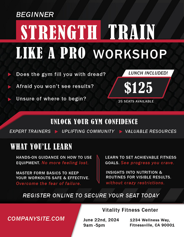
Typography and Color: Communicating Strength and Resolve
The selection of typefaces and color scheme was pivotal in achieving a visual representation of strength, determination, and professional expertise. The typography choices were carefully selected to not only capture attention but also to resonate with the audience on a psychological level.
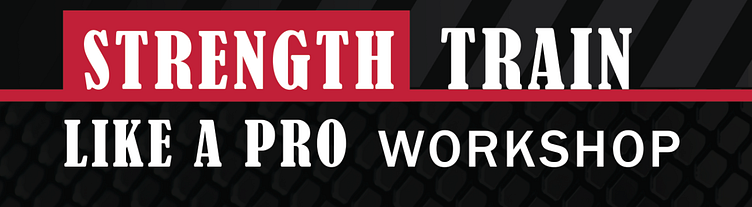
Bernard MT Condensed for Titles and Main Headings:
For the title and main headings, I chose Bernard MT Condensed, a typeface that exudes strength and command. Its bold, condensed letters stand out on the poster, immediately drawing the viewer's eye and setting the tone for the seminar's focus on professional-level strength training.
This choice was intentional, aiming to mirror the authoritative knowledge and solid techniques that participants can expect from attending the workshop.
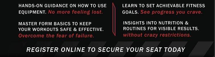
Franklin Gothic Medium for Body Text:
The body (along with some headline elements) uses Franklin Gothic Medium, a versatile and robust font that complements the assertiveness of Bernard MT Condensed while offering excellent readability.
To connect more personally with the audience, I varied the case usage within the copy. Sentence case echos the user's inner dialogue, subtly engaging with their thoughts and aspirations.
Strategic use of all caps in certain sections acts as a visual metaphor for the inner strength that the seminar aims to foster in participants.
Red Font for Contrast and Emotional Appeal:
Color plays a crucial role in the poster's visual hierarchy and emotional impact. By incorporating red for key textual elements, I aimed to create a stark contrast that not only grabs attention but also symbolizes passion, energy, and determination.
This choice directly addresses and combats the insecurities that often accompany the pursuit of fitness goals, offering a visual cue of empowerment and motivation.
Reflection
The creation of the "Strength Train Like a Pro" poster was a deeply rewarding process that allowed me to blend my design skills with my passion for fitness. By focusing on typography and strategic use of color and space, I aimed to convey a message of empowerment, resilience, and professional guidance.
This project underscored the importance of addressing user pain points in a meaningful way, transforming promotional material into a source of inspiration and motivation. It stands as a testament to the power of design in bridging the gap between aspiration and action, encouraging individuals to take proactive steps toward their fitness goals.
Through this poster, I hoped to not only attract participants to the workshop but also to inspire them to envision and pursue a stronger version of themselves, armed with the knowledge and confidence gained from training like a pro.