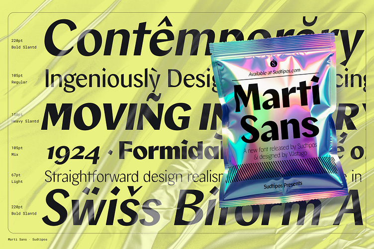
Marti Sans — A collaboration with Vástago
We are thrilled to introduce "Marti Sans," designed and produced by Estudio Vástago and distributed by Sudtipos. This font represents a modern reinterpretation of classic sans-serif typefaces with contrast, enriched with robust touches reminiscent of authentic flat-nib calligraphic strokes.
What truly sets Marti Sans apart is how it evolves across its various weights: while its heavier variants showcase the boldness of its slant and unique elements such as distorted dots, in the lighter weights, these details manifest more subtly, always retaining a refined elegance. This font achieves a perfect balance in its width, allowing for harmonious composition in both body text and headlines, aided by its reduced ascender height, which enhances readability and line spacing.
Marti Sans is more than just a typeface; it's a design statement that we highly recommend for use in websites, branding, and UX/UI design. It offers a contemporary alternative that stands out for its distinct personality and style. Moreover, it has been meticulously crafted to be versatile, straightforward, and of high quality, ensuring that each creation feels unique and appealing. Marti Sans is also available in a variable font format, offering even more flexibility and creative possibilities for designers.
We hope you enjoy using Marti Sans and find it to be a source of inspiration for your design projects.
—
Available at sudtipos.com


