Possible realign
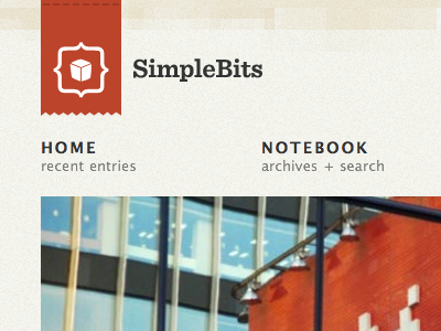
Still experimenting with a potential minor realign. Logo label and link color derived from rotating large photography on the homepage.
Also taking Sentinel for a spin for the logo type. Seems to fit the mark better for some reason.
All of this experimenting is in a sense, an undesigning. Using a photo to change things up whenever I have time, strip away design elements that aren't necessary (wood strips).
The tinkering, it continues. This is what happens when I try and take most of the week off.
More by Dan Cederholm View profile
Like
