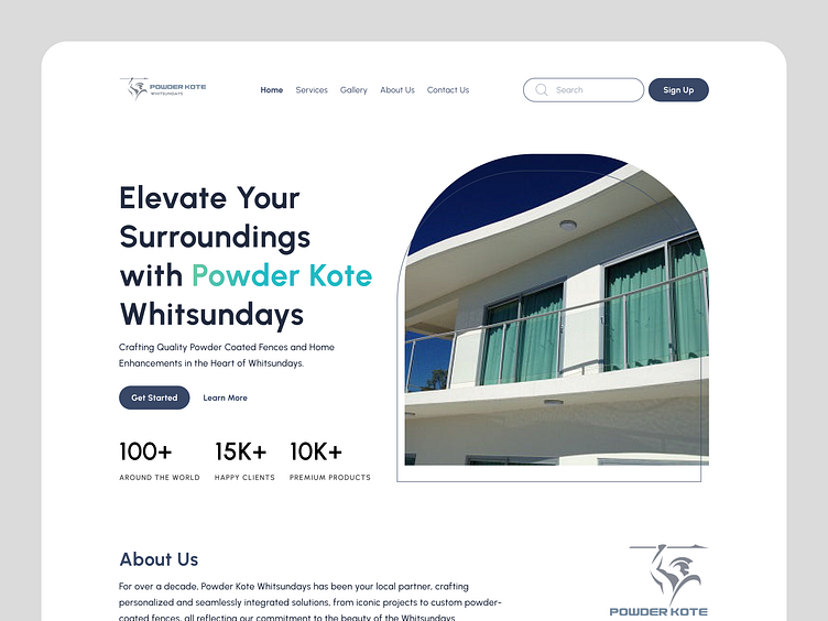
Hero Section Landing Page - Daily UI 037
Hello Dribbblers! 🔥
I want to share my latest exploration about furniture webisite. I create a web page with a clean, serious, modern design style, but still maintain the identity colors of Powder Kote which can display a professional and upscale impression.
The components on the page, i use Xline icon and Urbanist typography. The combination of the icon and typography is what displays a modern and professional impression.
✦✦✦
Have an idea to create a Furniture Website?
Feel free to reach me out!
Thanks for checking out my work on Dribbble! ✨
Connect with me on 🔗LinkedIn for more insights
and drop me an email at 📩kufiitardalli@gmail.com
to discuss collaborations or projects further.
Let's create something amazing together!✨
✦✦✦
tags : Musemind UI/UX Agency | QClay | Nixtio | Pixavall Studio | Ronas IT UI/UX Team | 69Pixels | Pickolabs | Unseen Studio | Creative South | Pixel | Elux Space | Dipa Inhouse | Extej Design Agency | Pixelate Studio | Keffi Studio | X Studio

