Calendar Dashboard Design Concept
💌 Have a web application idea? Let's make it together!
hello@ronasit.com | Telegram | WhatsApp | Website
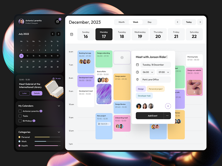
Hello everyone! We’d love to present our design concept for a new web calendar service designed to simplify the organization of meetings, events, and tasks.
The application features an organized column layout broken down by hours, making it straightforward to add and oversee various appointments - a design choice aimed at eliminating confusion and scheduling conflicts.
We chose a minimalist black-and-white color scheme with bright colors to highlight different event types. This not only makes the calendar visually appealing but also aids in quickly distinguishing between tasks and appointments.
At the heart of our design is an intuitive interface. We focused on ensuring that navigating through the calendar is a breeze, even for newcomers, prioritizing a hassle-free user experience that encourages efficient time management.


