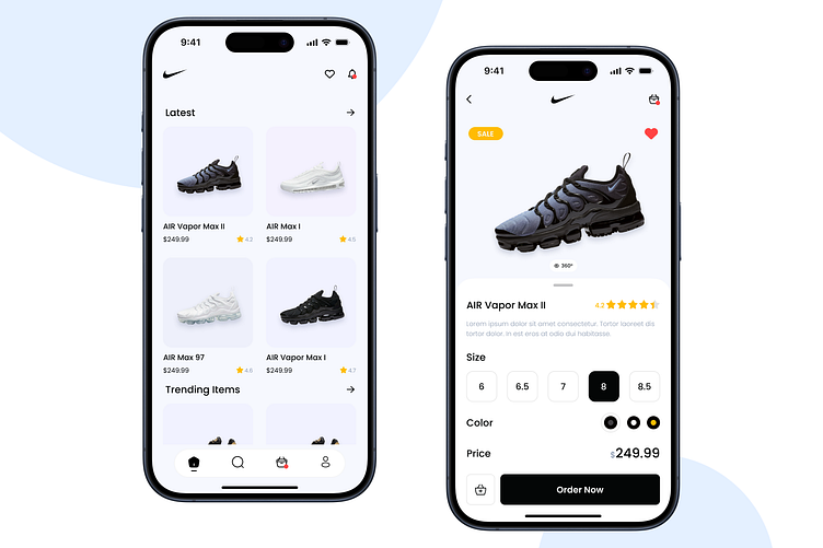
Nike App UI Redesign - UI/UX Daily Challenge II
👟 Hey Dribbblers! 🚀 Just wrapped up a 1-day challenge: Redesigning the Nike App UI! 🎨✨
🌟 The Challenge:
I dove into a sprint to reimagine every pixel of the Nike App. From dynamic color schemes to intuitive navigation, this redesign is a testament to pushing boundaries within a tight timeframe.
💡 Quick Glimpse: A Fresh Look for Nike – a sleek, dynamic UI that seamlessly blends style and function. Navigating through releases, personalized feeds, and a vibrant community hub has never been this smooth!
🏆 Key Highlights:
Dynamic Color Palette: Energetic hues for an immersive visual experience.
Intuitive Navigation: Redefined for seamless exploration.
Community Connection: A hub for athletes, all reimagined in just 24 hours.
🚀 Explore the Sprint: Redesigned Nike App
Feedback fuels the journey – let me know your thoughts on this whirlwind redesign! 🏃♂️💨 #NikeAppChallenge #UIRedesign #1DaySprint #JustDidIt
