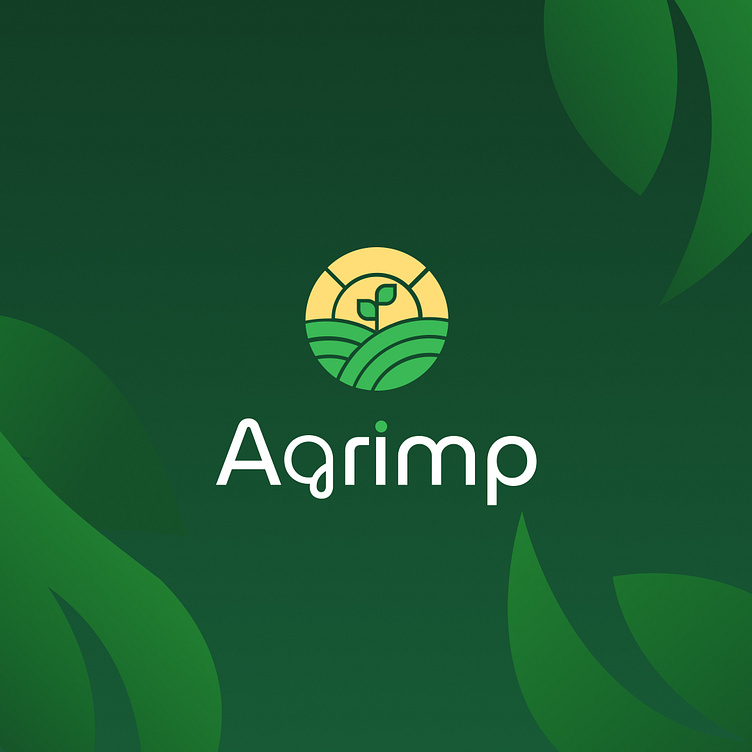
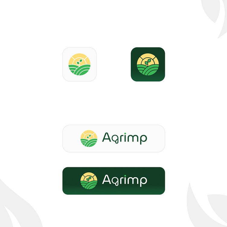
Agrimp- Logo Concept, branding, identity🌾
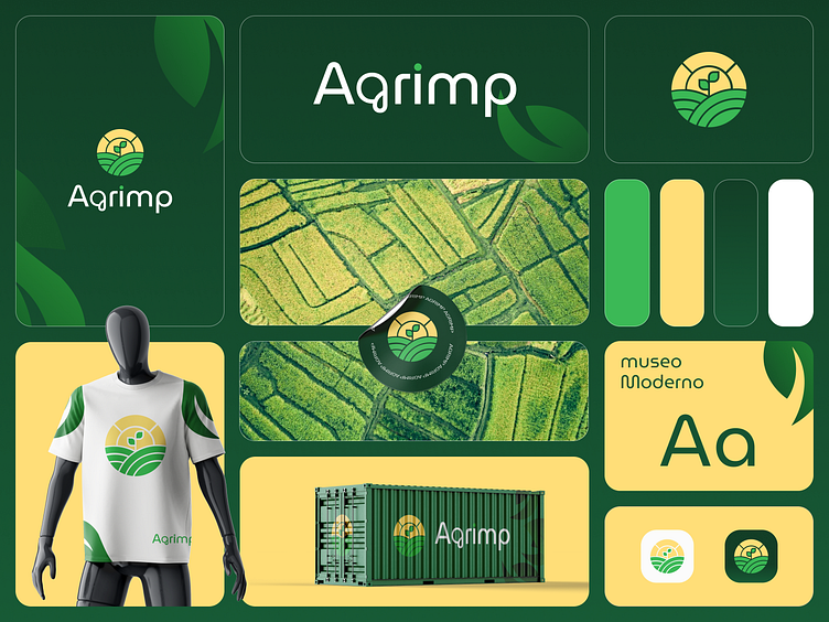
Introducing the logo concept for "Agrimp," a dynamic fusion of nature and agriculture encapsulated in a captivating round emblem. This logo not only represents the brand but also conveys the essence of growth, vitality, and sustainable farming practices.
The circular design serves as a visual metaphor for unity and continuity within Agrimp's agricultural endeavors.
Radiating from the center, the golden sun and its rays add a touch of warmth and energy, embodying the nourishing power of sunlight in the growth process. The sun not only illuminates the fields but also signifies the dawn of new possibilities and growth for Agrimp.
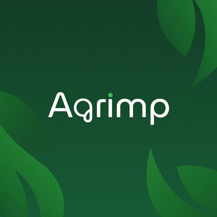
The typography complements the overall design with its round-cornered, friendly, and unique fonts. The chosen font reflects Agrimp's approachability and commitment to building relationships within the agricultural community. The rounded corners add a touch of softness, creating a welcoming and approachable aesthetic.
Incorporating a palette of green and yellow, the logo resonates with the colors of nature, prosperity, and sunshine. The harmonious blend of these colors reinforces Agrimp's connection to the land and its dedication to fostering sustainable agricultural practices.


In conclusion, the Agrimp logo is more than just a visual identity; it is a reflection of the company's values, aspirations, and harmonious integration with the natural world. It stands as a beacon of growth, sustainability, and a commitment to cultivating a greener future. 🌾✨