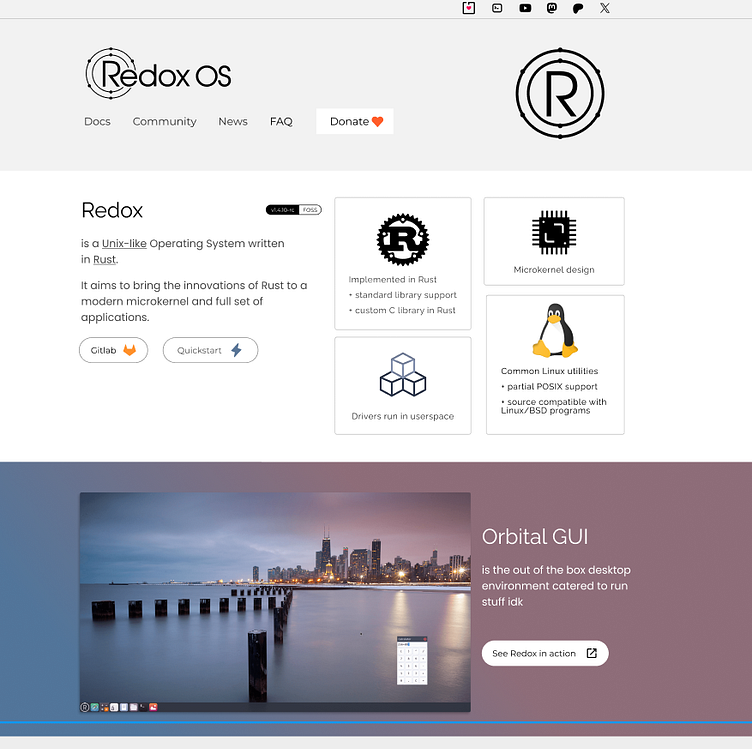
Redox OS candidate website in Figma
Compared from the old design, I utilized white space for breath-ability as the clutter is cleared
Here's a version for phone and tablet form factors. Mobile gets a drop-down menu for the limited screen real estate and even accounts for the middle notch of some phone models
More by YorQat View profile
Like

