Modularity Figma Web Design UI Kit
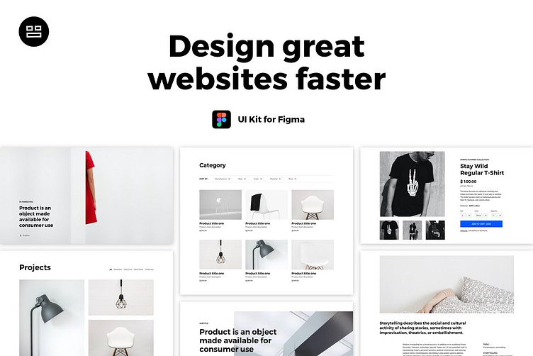
Modularity is created to help designers focus on the creative part of work instead of routine tasks like defining dozens of typography and elements styles.
Learn web design, kickstart your next project by adding your content to the selected sections, experiment with easily customizable colors, icons, text styles, and buttons, iterate to define the best structure of your website using predefined modules.
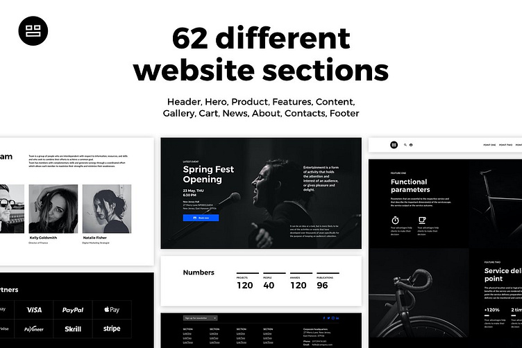
62 modules of popular website sections Sections included: Header, Hero, Product, Features, Content, Gallery, Cart, News, About, Contacts, Footer
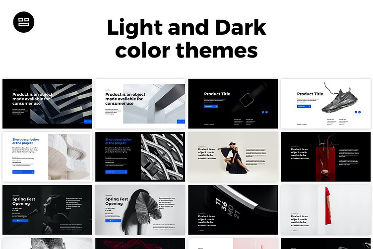
Two color themes (Black & White)
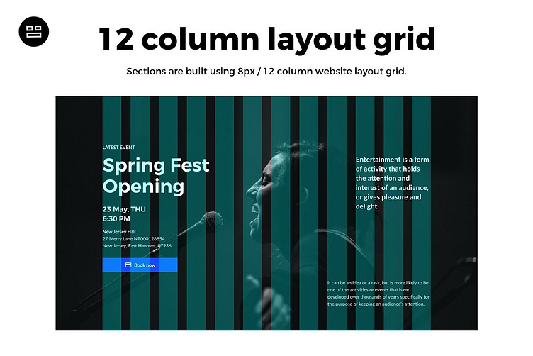
All modules are built using the 8px / 12 columns web grid
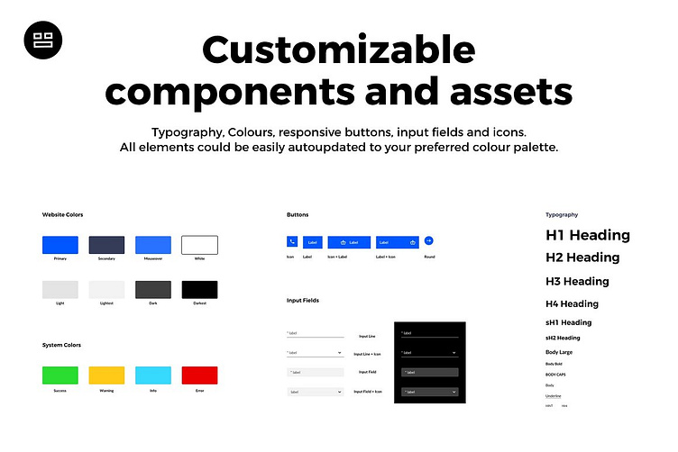
Customizable components and assets: typography, colors, responsive buttons, input fields and icons could be easily auto-updated to your preferred color palette
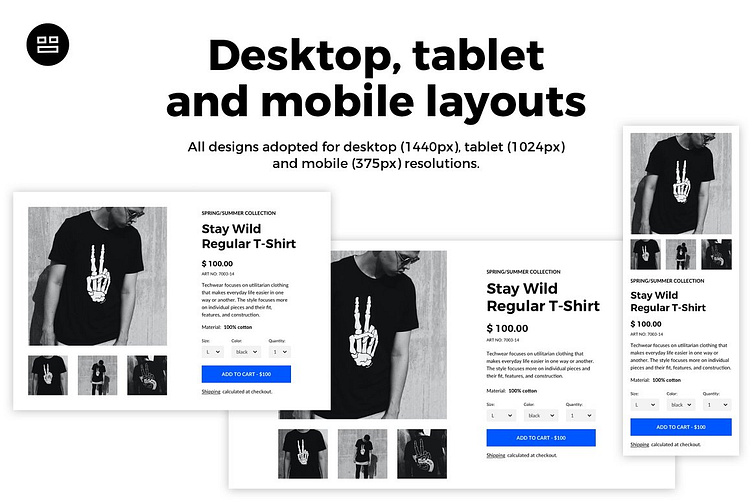
Layouts for desktop, tablet & mobile: all designs adopted for desktop (1440px), tablet (1024px) and mobile (375px) resolutions.
Experiment with your website structure using different modules, customize fonts and elements styles, choose project colors - free up your creative energy. Create fresh website designs beyond standard boring templates with Modularity.
WHAT'S INCLUDED:
Style Guide:
Logo
Typography styles (H1-H4, sH1-sH2, Body, Body Bold, Body Caps, Body Large, Underlined, Hint, Hint Bold)
Color styles
Buttons
Input fields
Icons
Resolutions:
Descktop (1440px)
Tablet (1024px)
Mobile (375px)
Grid:
Layout grid: 12 columns (desktop), 2 columns (mobile)
Grid: 8 px
Sections:
Hero: 12
Header: 8
Menu: 5
Gallery: 3
Product: 3
Cart: 1
News: 2
Content: 7
Features: 2
Team: 3
Partners: 2
Numbers: 2
Contacts: 3
Footer: 8
Fonts:
Montserrat
Lato
Photos by freepikes
We use Modularity in our everyday design process. Actually, it was created for ourselves and then presented to the designer’s community.