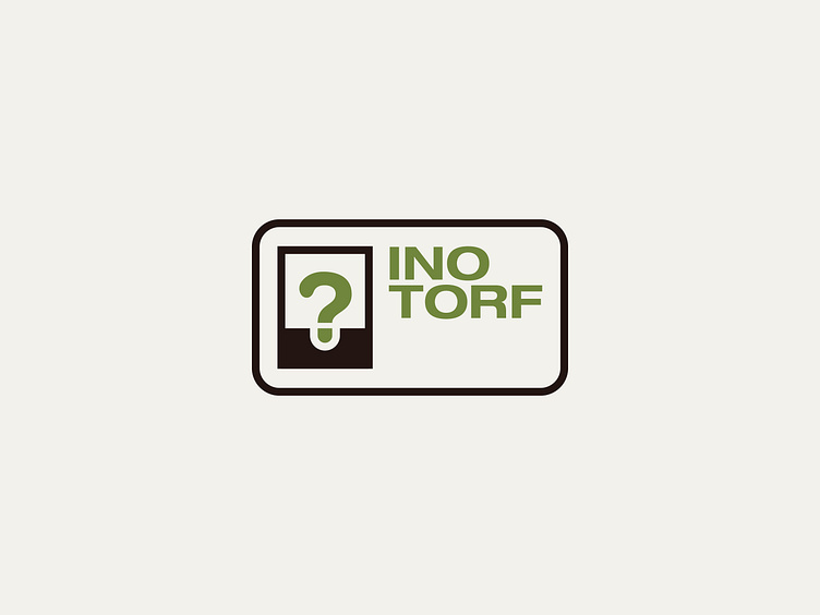
INOTORF
In the realm of logo design, I embrace the unconventional. With the Inotorf project, I took a daring approach, creating a dynamic brand identity that defies norms. Each plant has unique needs, and Inotorf's branding reflects this diversity.
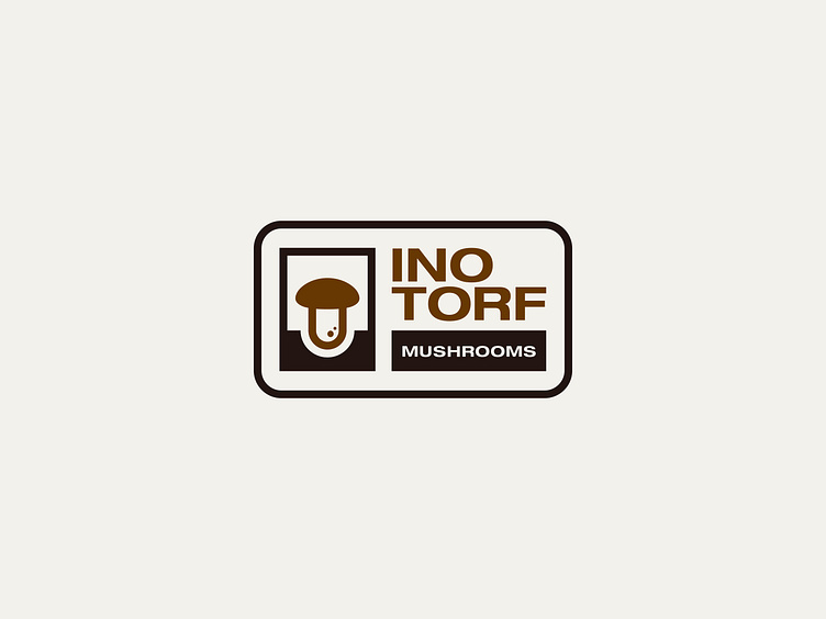
At its core is the ID card concept, where a seedling forms a question mark within the logo. This symbolizes growth and exploration. As needed, the question mark transforms into an icon representing specific products like plants or mushrooms, ensuring visual cohesion across the brand's lineup. This innovative approach showcases Inotorf's adaptability and creativity, setting it apart in the market.
MAIN LOGO DESIGN
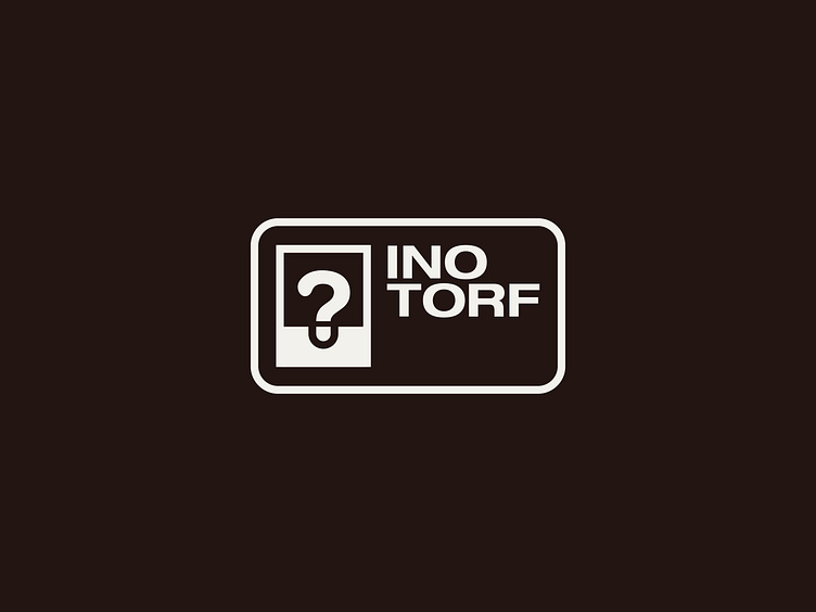
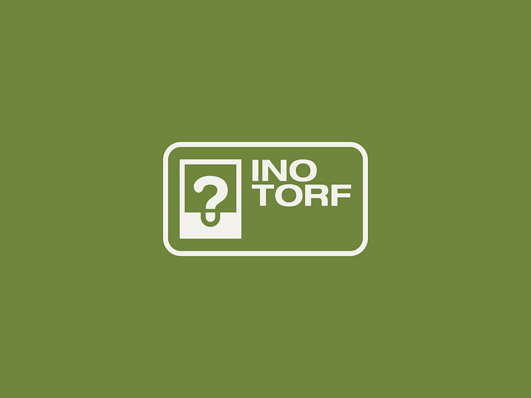
LOGO ADAPTATIONS
˙ ˖ ✦ Thanks for wandering! ✦ ˖ ˙
Dive into the visual storytelling magic at www.PointyHat.studio ✨ where you may hire a wizard for your creative endeavors or delve into our portfolio even deeper! 🧙♂️ Follow your nose!👃
