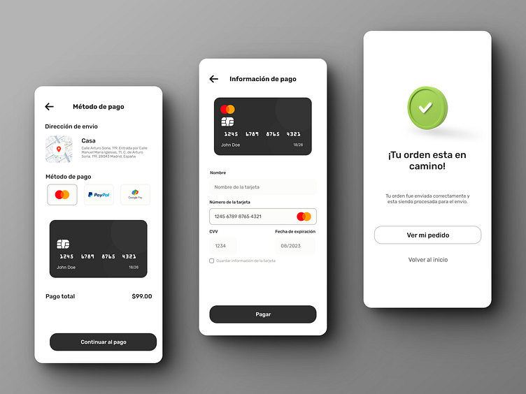
Minimalist dark Payment form
Explore this sleek mobile app design featuring a trio of screens dedicated to an online shopping process. Embracing a minimalist color scheme, this interface design prioritizes clarity and ease of use. The color black takes center stage, offering a sophisticated and modern aesthetic that enhances the user experience. Dive into the details of each screen, designed to guide users seamlessly through their purchasing journey, from product selection to final checkout. This design not only highlights the elegance of simplicity but also showcases the power of a focused color palette in creating an engaging and user-friendly mobile app environment
More by Gabriel Vallejo View profile
Like
