Cutesy Portfolio Attempt 2 - Yavuz
So I started working on a new portfolio site. I am really looking for cutesy and effective, so I came up with this one page design. I think I'm going to change it once again however! There's a couple of things I didn't like about it.
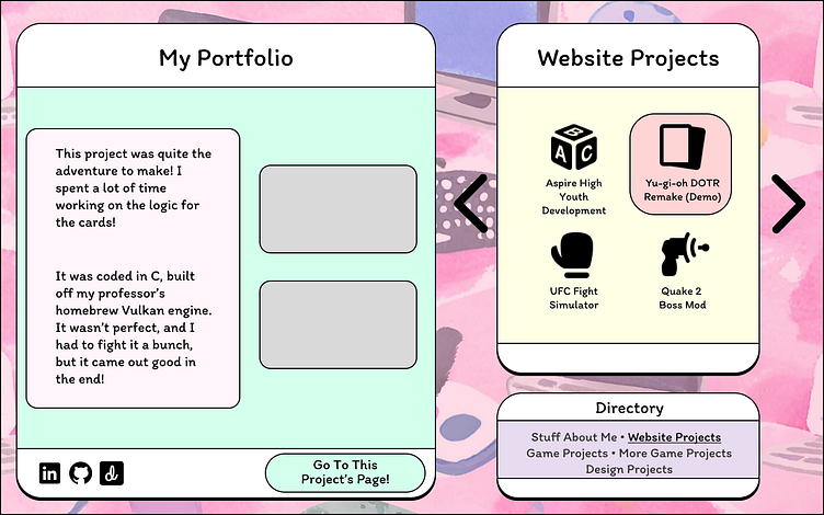
For one I feel the carousel for the icons would be really annoying to navigate. Like the idea was that the directory would help with going through the icons, but I don't feel like that's clear enough, perhaps with a different name it would help, another notion would be to get rid of the arrows on the side and leave navigating to just the directory, but I'm not confident that people would catch on to that immediately.
This brings me to my second point is that this would be made completely differently for a mobile page. I don't think this is too bad from a user point of view, but from where I'm standing that would be a lot of work to rework the site entirely for mobile.
Lastly I don't really have an idea in mind for displaying the project info on the right, given 2 pictures and 2 paragraphs. I'll figure something out though.
So in conclusion I'm going to keep the aesthetic, love the aesthetic I have so far, but I'm going to work on repositioning how everything is laid out and how the user can engage with the page.
