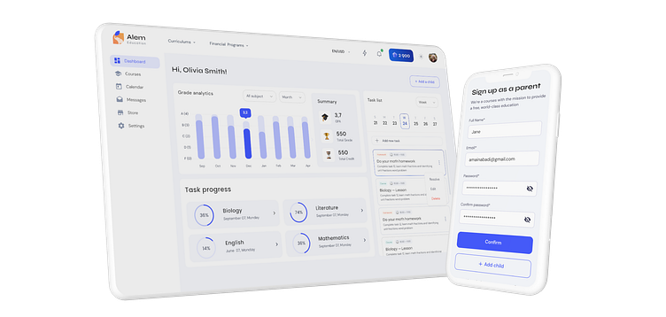
Financial Educational platform
AI-powered Edtech platform
Problem:
Inconsistent user experience across the platform and unclear advantages for junior students. Low web content accessibility rating and low user satisfaction scores.
Solution:
Improving the legacy information architecture, designing mid-fidelity mockups, and creating a design system to ensure consistency and accessibility for different user groups. Handing off the designs with attention to color, typography, and accessibility. Improving the admin pages with better usability and a consistent visual style with the user-facing app.
Improving the Legacy Information Architecture
Before jumping into wireframing, I mapped the legacy IA to understand the platform and where it was falling behind to map out the new and improved information architecture.
Design System
By paying attention to the details and structure of the project, a design system was created that covers all user scenarios.


