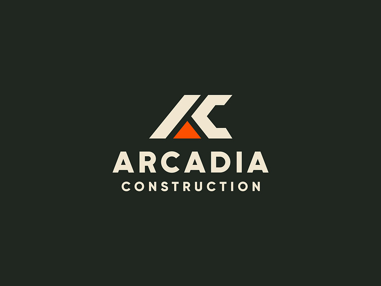
Arcadia Construction Rebrand
Introducing the rebrand for Arcadia Construction! 🪚🔨
Our design team explored many different design concepts and directions, and arrived at this simple, strong "AC"monogram. The logo mark works well at smaller sizes, and the pop of bright red, really brings the brand to life! We trust that this fresh visual brand will serve Arcadia for years to come.
More by Fruitful Design & Strategy View profile
Like


