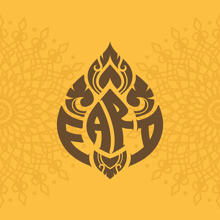
FARA WINE | LOGO DESIGN & BRAND IDENTITY
Phan Rang grape wine is a precious gift made from the sweet fruits of the sunny and windy land. The sweet, passionate taste of this specialty makes the hearts of people enjoy it. Understanding that, FARA was born, bringing excellent wine products, which is the convergence of rustic and natural flavors of heaven and earth.
FARA's brand identity is a breakthrough combination of tradition and modernity, between the rustic antiquity of Champa culture and the modern luxury of Western culture. The logo is inspired by the image of lotus flowers in traditional sculptural motifs of Champa culture, conveying the story of a special grape wine cherished in the land of blending sunshine and wind Phan Rang - Thap Cham. The yellow color represents the sunny and earthy color of Phan Rang, and at the same time creates a premium for the product.
Designed by Bee Art
-
Client FARA
Logo and Branding Project. Logo is designed for Alcohol Drink Brand in Vietnam.
Copyright © Bee Art. All Right Reserved
Contact us:
• Hotline/ Zalo: (+84) 77 34567 18
• Email: info@beeart.vn
• Website: www.beeart.vn
• Facebook: https://www.facebook.com/BeeArt.vn


