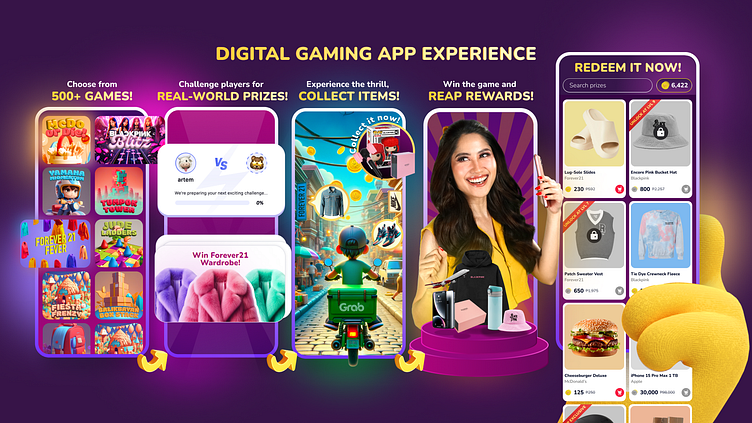
Game Application Platform Snapshot
When I got the team's directive to enhance our product app poster, I knew exactly what to do.
User Flow
I added a crucial 5th step to make the user journey smoother and more engaging
.
Visuals
I refined the visuals to improve the information flow and ensure everything looks cohesive and appealing.
Colors
I tweaked the color palette to make the design more vibrant and eye-catching.
Brand Elements
I incorporated key elements from our brand guidelines, like influencer photos and our mascot, to keep everything consistent.
Thematic Vibe
I enhanced the app's theme to make the user experience more dynamic and immersive.
This process ensures our app snapshots go beyond just visuals—they tell a story that's clear and cohesive. Swipe left to see the evolution!
For questions, collabs, or a chat about this design journey, connect with me at yojolo.design@gmail.com 🪁⚡️


